Brand identity inspired by heritage, elevated for a modern world
Project Overview
Embarking on a transformative journey, Vaera, named after a significant Parashah, sought to elevate its brand to new heights. Our task was to create a branding strategy that reflected themes of ascent, enlightenment, and unity, encapsulating the essence of their Hebrew heritage while resonating with a contemporary audience.
Challenges and Objectives
The branding challenge for Vaera was multifaceted:
-
To infuse the brand with a sense of 'elevation,' aligning with the company's aspirations to lead and inspire.
-
To integrate the concept of 'light,' a metaphor for wisdom and clarity, drawn from the brand’s Hebrew roots.
-
To foster 'cohesion,' ensuring that the brand's diverse offerings appeared united under one coherent and compelling identity
Industry
Coaching
Services
Branding
Strategy
Visual Identity
Timeline
12 weeks
.png)
Challenges and Objectives
Logotype
The branding challenge for Vaera was multifaceted:
-
To infuse the brand with a sense of 'elevation,' aligning with the company's aspirations to lead and inspire.
-
To integrate the concept of 'light,' a metaphor for wisdom and clarity, drawn from the brand’s Hebrew roots.
-
To foster 'cohesion,' ensuring that the brand's diverse offerings appeared united under one coherent and compelling identity.
.png)
.png)
.png)
.png)
Strategy and Approach:
Our approach was meticulously crafted to interweave the foundational elements of Vaera's identity:
-
Cultural Synthesis: We analyzed the Parashah Vaera, extracting themes of ascension and illumination that were pivotal in shaping the brand's narrative.
-
Design Philosophy: The logo and color palette were designed to embody the principles of light and elevation, using ascending shapes and gradients that suggest upward movement and enlightenment.
Execution
The branding elements were carefully executed to ensure consistency and cohesion:
-
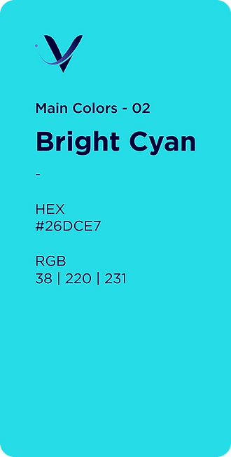
Visual Identity: The 'long version' logo symbolizes a journey upward, towards excellence and innovation, while the 'short version' offers a concentrated burst of brand energy. A gradient color palette moving from deep, trustworthy blue to an inspiring teal captures the transition from tradition to modernity, from depth to ascension.
-
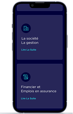
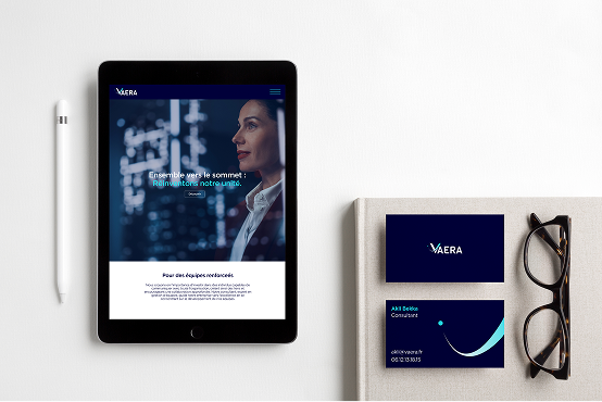
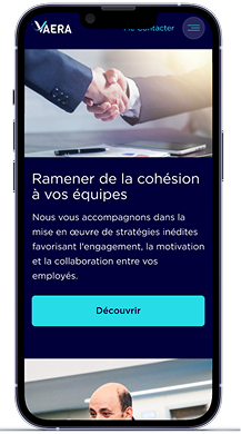
Brand Collateral: We designed a suite of materials, including an evocative website interface, business stationery, and office branding that radiated the brand's core values of unity and progression.
Design System


Result and Impact:
The reimagined brand identity profoundly impacted Vaera's market presence:
-
The brand now embodies an ethos of 'elevation,' with its sights set on lofty goals and high standards.
-
'Light' is manifested in the brand's commitment to clarity, innovation, and wisdom, offering guidance and insight to its customers.
-
'Cohesion' is evident across all brand touchpoints, presenting a unified, strong image that ties back to the core message encapsulated in the tagline, "Together towards the summit: Reinventing our unity."
Through these branding efforts, Vaera has successfully carved out a position not only as a market leader but as a beacon of unity and enlightenment in its industry.