

Phoenix Student
Phoenix Student
The same company, in a softer voice: an identity to bring pharmacy students in
Aperçu du projet
PHOENIX OCP is France's leading pharmaceutical distributor, delivering three million medicines a day. Its brand is built for that scale and for the pharmacies it serves. Pharmacy students are a different audience and needed a voice of their own.
So we gave PHOENIX OCP a second identity, made only for students. Same logo, same green at its heart, then everything around it softened: pastel colours, a hand-written script, rounded shapes, warm portraits. Posters, flyers, a presentation, a leaflet and social templates, all built to live in faculties and at student forums and to make a future pharmacist stop, smile and ask what the job is.
Défis & objectifs
Most pharmacy students have never heard of pharmaceutical distribution. The profession sits between the faculty and the counter, and nobody talks about it. PHOENIX OCP wanted to be the one who does and to recruit.
The corporate brand speaks to pharmacies and partners, in a register made for them. Students needed something else: an identity that feels light, warm and current, and still belongs to a leader in healthcare. It had to be young without trying too hard. No campus clichés, nothing childish.
Phoenix Student
The same company, in a softer voice: an identity to bring pharmacy students in
Aperçu du projet
PHOENIX OCP is France's leading pharmaceutical distributor, delivering three million medicines a day. Its brand is built for that scale and for the pharmacies it serves. Pharmacy students are a different audience and needed a voice of their own.
So we gave PHOENIX OCP a second identity, made only for students. Same logo, same green at its heart, then everything around it softened: pastel colours, a hand-written script, rounded shapes, warm portraits. Posters, flyers, a presentation, a leaflet and social templates, all built to live in faculties and at student forums and to make a future pharmacist stop, smile and ask what the job is.
Défis & objectifs
Most pharmacy students have never heard of pharmaceutical distribution. The profession sits between the faculty and the counter, and nobody talks about it. PHOENIX OCP wanted to be the one who does and to recruit.
The corporate brand speaks to pharmacies and partners, in a register made for them. Students needed something else: an identity that feels light, warm and current, and still belongs to a leader in healthcare. It had to be young without trying too hard. No campus clichés, nothing childish.
Client
Phoenix Student
Secteur
Healthcare & Pharma
Services
Branding
Art Direction
Brand Guidelines
Durée
8 weeks
Année
Client
Phoenix Student
Secteur
Healthcare & Pharma
Services
Branding
Art Direction
Brand Guidelines
Durée
8 weeks
Année

Our Approach
We kept the green and softened everything around it. This identity is gentle and leaves air on the page. We set the rhythm before we drew a single element: shorter lines, bigger words, one idea at a time, and a script voice that breaks the capitals like a smile breaks a formal face.
Every layout was tested on one scene: a student forum, thirty stands, three seconds of attention. If it didn't read from five meters away and didn't feel kind up close it didn't stay.
Logo
The PHOENIX OCP logo belongs to the group. We left its drawing and lockup untouched and built the student identity around it.
Design System
Design System
Our Approach
We kept the green and softened everything around it. This identity is gentle and leaves air on the page. We set the rhythm before we drew a single element: shorter lines, bigger words, one idea at a time, and a script voice that breaks the capitals like a smile breaks a formal face.
Every layout was tested on one scene: a student forum, thirty stands, three seconds of attention. If it didn't read from five meters away and didn't feel kind up close it didn't stay.
Logo
The PHOENIX OCP logo belongs to the group. We left its drawing and lockup untouched and built the student identity around it.
Design System


Typography
Two typefaces, deliberately mismatched. Ticdar is the primary: a rounded, friendly sans in four weights, set big sometimes very big. Borthans is the secondary: a brush script that looks written by hand, kept for the human part of the message.
The pairing is the whole identity in miniature. "LEADER DE LA RÉPARTITION PHARMACEUTIQUE EN FRANCE" in confident capitals across the width; underneath, in script, "Parce que la santé évolue, votre carrière aussi". The institution, then the person. Key words are scaled up, cropped or highlighted so a poster reads in one glance, and the script gives every layout its softness.
Colour Palette
Six colours, three and three. From the group: Phoenix Deep Green, Sage Green, Soft Yellow. New, and pastel: Ice Blue, Coral, Dusty Rose.
The pastels set the mood. They lighten the green, make the identity warm and current, and separate student communication from corporate communication at a glance. Nothing shouts: the contrast comes from the pairings Deep Green on Dusty Rose, Coral on Soft Yellow, script over Ice Blue not from the volume.
Typography
Two typefaces, deliberately mismatched. Ticdar is the primary: a rounded, friendly sans in four weights, set big sometimes very big. Borthans is the secondary: a brush script that looks written by hand, kept for the human part of the message.
The pairing is the whole identity in miniature. "LEADER DE LA RÉPARTITION PHARMACEUTIQUE EN FRANCE" in confident capitals across the width; underneath, in script, "Parce que la santé évolue, votre carrière aussi". The institution, then the person. Key words are scaled up, cropped or highlighted so a poster reads in one glance, and the script gives every layout its softness.
Colour Palette
Six colours, three and three. From the group: Phoenix Deep Green, Sage Green, Soft Yellow. New, and pastel: Ice Blue, Coral, Dusty Rose.
The pastels set the mood. They lighten the green, make the identity warm and current, and separate student communication from corporate communication at a glance. Nothing shouts: the contrast comes from the pairings Deep Green on Dusty Rose, Coral on Soft Yellow, script over Ice Blue not from the volume.


Graphic Language
Curves, never corners. A small family of shapes rounded panels, tabs, scalloped badges, a hand-drawn arrow frames photography and holds text without boxing it in. Portraits are cut out and overlap the shapes, so people come forward and the page gets depth.
One line runs through everything: "De l'amphi à l'officine" from the lecture hall to the pharmacy. Repeated, stacked, finished in script, it became a graphic element in its own right. Photography is warm and natural: students, young pharmacists, white coats and big smiles.
Presentation
The student presentation is where the identity does its real job: explaining a profession in fifteen minutes to a lecture hall that has never heard of it. We rebuilt it as a story "Dans les coulisses de la distribution des produits de santé" in fourteen slides.
One idea per slide, one colour per chapter. Figures are set huge and left alone: 57 sites, 3 million medicines a day, 24 hours to deliver, -80% carbon on inbound flows. The four public service obligations become four cards, the network becomes a map of France, and the deck turns coral for one slide "PHOENIX OCP recrute" before closing on the two ways in: the master's in Limoges and the Pharm'Academy.
Graphic Language
Curves, never corners. A small family of shapes rounded panels, tabs, scalloped badges, a hand-drawn arrow frames photography and holds text without boxing it in. Portraits are cut out and overlap the shapes, so people come forward and the page gets depth.
One line runs through everything: "De l'amphi à l'officine" from the lecture hall to the pharmacy. Repeated, stacked, finished in script, it became a graphic element in its own right. Photography is warm and natural: students, young pharmacists, white coats and big smiles.
Presentation
The student presentation is where the identity does its real job: explaining a profession in fifteen minutes to a lecture hall that has never heard of it. We rebuilt it as a story "Dans les coulisses de la distribution des produits de santé" in fourteen slides.
One idea per slide, one colour per chapter. Figures are set huge and left alone: 57 sites, 3 million medicines a day, 24 hours to deliver, -80% carbon on inbound flows. The four public service obligations become four cards, the network becomes a map of France, and the deck turns coral for one slide "PHOENIX OCP recrute" before closing on the two ways in: the master's in Limoges and the Pharm'Academy.


Print Templates
Print is where a student meets PHOENIX OCP first: on a faculty noticeboard, at a forum stand, in a hand. Every format is built as a template. The team swaps a portrait, updates a figure or changes a date, and the layout holds.
Posters & Flyers
A person first, the facts second. "PHOENIX OCP recrute les pharmaciens de demain" in capitals and script, two key figures across the top, one QR code in the corner. Two versions, one structure, pinned up in faculties.
Print Templates
Print is where a student meets PHOENIX OCP first: on a faculty noticeboard, at a forum stand, in a hand. Every format is built as a template. The team swaps a portrait, updates a figure or changes a date, and the layout holds.
Posters & Flyers
A person first, the facts second. "PHOENIX OCP recrute les pharmaciens de demain" in capitals and script, two key figures across the top, one QR code in the corner. Two versions, one structure, pinned up in faculties.

Social Media
On social, each post carries one message. "Nos opportunités" in three steps. One key figure, set huge. "Votre avenir commence ici", with a smiling portrait. Same pastels and same rounded shapes as the print, sized for the feed.
Templates
The templates work as a set: "Évoluez. Explorez. Avancez.", "Pharmaciens de demain", "Futurs pharmaciens", "PHOENIX OCP recrute". The team drops in a photo and a line, and the post is ready. Enough variety to run a full academic year.
Social Media
On social, each post carries one message. "Nos opportunités" in three steps. One key figure, set huge. "Votre avenir commence ici", with a smiling portrait. Same pastels and same rounded shapes as the print, sized for the feed.
Templates
The templates work as a set: "Évoluez. Explorez. Avancez.", "Pharmaciens de demain", "Futurs pharmaciens", "PHOENIX OCP recrute". The team drops in a photo and a line, and the post is ready. Enough variety to run a full academic year.


Brand Elements
Three small marks sign everything: a tab that carries "Leader de la répartition pharmaceutique en France", a scalloped badge and a label written in script. They sit in the corner of a poster or a post, and they work in every colour of the palette.
Stickers
Then they became stickers. Six of them, one for each colour, because at a student fair the thing that ends up on a laptop wins.
Brand Elements
Three small marks sign everything: a tab that carries "Leader de la répartition pharmaceutique en France", a scalloped badge and a label written in script. They sit in the corner of a poster or a post, and they work in every colour of the palette.
Stickers
Then they became stickers. Six of them, one for each colour, because at a student fair the thing that ends up on a laptop wins.


Leaflet
The fold-out leaflet is what a student takes home, so it had to work at the bottom of a tote bag as well as on a table. One colour per panel Ice Blue cover, Deep Green contact, Dusty Rose key figures, Coral careers, Soft Yellow master's. Unfolded, it reads like the palette itself.
The cover carries the promise "Futurs pharmaciens, votre avenir commence ici" with a student cut out over the type. Inside, headings pair Ticdar capitals with one word in script, the QR code sits in a scalloped badge, and the copy is cut to what someone actually reads between two lectures.
Applications
Put together, the pieces work as one kit. A student sees the poster in the faculty, the post in their feed, the stand at the forum and the leaflet in their bag. Different formats, same voice. And because everything is built as a template, the team adds the next piece itself.
Leaflet
The fold-out leaflet is what a student takes home, so it had to work at the bottom of a tote bag as well as on a table. One colour per panel Ice Blue cover, Deep Green contact, Dusty Rose key figures, Coral careers, Soft Yellow master's. Unfolded, it reads like the palette itself.
The cover carries the promise "Futurs pharmaciens, votre avenir commence ici" with a student cut out over the type. Inside, headings pair Ticdar capitals with one word in script, the QR code sits in a scalloped badge, and the copy is cut to what someone actually reads between two lectures.
Applications
Put together, the pieces work as one kit. A student sees the poster in the faculty, the post in their feed, the stand at the forum and the leaflet in their bag. Different formats, same voice. And because everything is built as a template, the team adds the next piece itself.

Livrables
Student identity concept and moodboard
Colour palette: three group colours, three new pastels
Typography system: Ticdar and Borthans
Graphic elements: shapes, badges, arrows, pattern
Tagline lockup: "De l'amphi à l'officine"
Photography direction
Brand guideline
Student presentation, 14 slides
Fold-out leaflet
Posters, flyers, social media templates, stickers
Résultat
PHOENIX OCP now speaks two ways. The corporate voice for pharmacies and partners; a softer, pastel, hand-written one for the pharmacists of tomorrow. Side by side, you'd know they're the same company and you'd never mistake one for the other.
The team has a guideline and templates it can run without us, from the first forum of the year to the last post of the term. And a student walking past the stand now sees something made for them: a partner from the lecture hall to the pharmacy.
Livrables
Student identity concept and moodboard
Colour palette: three group colours, three new pastels
Typography system: Ticdar and Borthans
Graphic elements: shapes, badges, arrows, pattern
Tagline lockup: "De l'amphi à l'officine"
Photography direction
Brand guideline
Student presentation, 14 slides
Fold-out leaflet
Posters, flyers, social media templates, stickers
Résultat
PHOENIX OCP now speaks two ways. The corporate voice for pharmacies and partners; a softer, pastel, hand-written one for the pharmacists of tomorrow. Side by side, you'd know they're the same company and you'd never mistake one for the other.
The team has a guideline and templates it can run without us, from the first forum of the year to the last post of the term. And a student walking past the stand now sees something made for them: a partner from the lecture hall to the pharmacy.
Autres études de cas

Jigsaw Avenue
Jigsaw Avenue fabrique en Grande-Bretagne des puzzles de 1 000 pièces inspirés de l'art contemporain. Nous avons conçu le packaging et dirigé la photographie : une boîte qui se choisit comme un livre et reste exposée une fois le puzzle terminé.
PACKAGING
B2C
LIFESTYLE
Jigsaw Avenue
Jigsaw Avenue fabrique en Grande-Bretagne des puzzles de 1 000 pièces inspirés de l'art contemporain. Nous avons conçu le packaging et dirigé la photographie : une boîte qui se choisit comme un livre et reste exposée une fois le puzzle terminé.
PACKAGING
B2C
LIFESTYLE

Depop
Depop est la marketplace mode où des millions de personnes achètent et vendent de la seconde main. Nous avons construit son design system interne avec l'équipe de marque : seize chapitres de guidelines marque, produit et partenaires, réunis au même endroit et ouverts à toute l'entreprise.
UX/UI & développement
Figma
B2C
MODE
TECH
Depop
Depop est la marketplace mode où des millions de personnes achètent et vendent de la seconde main. Nous avons construit son design system interne avec l'équipe de marque : seize chapitres de guidelines marque, produit et partenaires, réunis au même endroit et ouverts à toute l'entreprise.
UX/UI & développement
Figma
B2C
MODE
TECH

Clé de Peau Beauté
Nous avons conçu une série de pages de campagne pour Clé de Peau Beauté, en transformant chaque lancement de soin de luxe en un récit cinématographique et éditorial plutôt qu'en une simple bannière. Trois campagnes, Radiant Cream Foundation, Restorative Cream Supreme et La Crème, chacune avec sa propre audience et sa propre porte d'entrée émotionnelle, au sein du système de composants Figma existant de CPB.
UX/UI & développement
B2C
Campagne
LUXE
SOIN
Clé de Peau Beauté
Nous avons conçu une série de pages de campagne pour Clé de Peau Beauté, en transformant chaque lancement de soin de luxe en un récit cinématographique et éditorial plutôt qu'en une simple bannière. Trois campagnes, Radiant Cream Foundation, Restorative Cream Supreme et La Crème, chacune avec sa propre audience et sa propre porte d'entrée émotionnelle, au sein du système de composants Figma existant de CPB.
UX/UI & développement
B2C
Campagne
LUXE
SOIN

Libe
LIBE est une marque parisienne de loungewear fondée sur le confort, des matières premium et des imprimés artistiques exclusifs. Nous avons créé l'intégralité de son expérience Shopify luxe : direction artistique, UX/UI, développement. Le storytelling éditorial et les collaborations avec des artistes portent chaque collection.
UX/UI & développement
B2C
LUXE
MODE
Libe
LIBE est une marque parisienne de loungewear fondée sur le confort, des matières premium et des imprimés artistiques exclusifs. Nous avons créé l'intégralité de son expérience Shopify luxe : direction artistique, UX/UI, développement. Le storytelling éditorial et les collaborations avec des artistes portent chaque collection.
UX/UI & développement
B2C
LUXE
MODE

Naked Era
Nous avons créé une expérience Shopify raffinée pour NAKED ERA, une marque de maillots de bain féminine construite autour du soleil, de la peau, du voyage et d'une confiance naturelle. Le résultat est un univers estival complet, logo, typographie, site et templates de campagne, qui traduit l'esprit méditerranéen de la marque en un monde ludique, ensoleillé et simple à acheter.
UX/UI & développement
B2C
E-COMMERCE
MODE
Identité de marque
Naked Era
Nous avons créé une expérience Shopify raffinée pour NAKED ERA, une marque de maillots de bain féminine construite autour du soleil, de la peau, du voyage et d'une confiance naturelle. Le résultat est un univers estival complet, logo, typographie, site et templates de campagne, qui traduit l'esprit méditerranéen de la marque en un monde ludique, ensoleillé et simple à acheter.
UX/UI & développement
B2C
E-COMMERCE
MODE
Identité de marque

Zoe Kratzmann
Nous sommes le partenaire email au long cours de Zoe Kratzmann et pilotons, via Figma et Klaviyo, le canal de revenu le plus direct d'une marque de mode. Un design system modulaire et des intégrations guidées par la donnée rendent chaque envoi soigné, actuel et on-brand : il convertit sans jamais ressembler à une promo.
DESIGN D'EMAILS CRM
B2C
MODE
Zoe Kratzmann
Nous sommes le partenaire email au long cours de Zoe Kratzmann et pilotons, via Figma et Klaviyo, le canal de revenu le plus direct d'une marque de mode. Un design system modulaire et des intégrations guidées par la donnée rendent chaque envoi soigné, actuel et on-brand : il convertit sans jamais ressembler à une promo.
DESIGN D'EMAILS CRM
B2C
MODE

Amazon Salon
Nous avons façonné l'identité de marque d'Amazon Salon, un salon de coiffure à Spitalfields Market, Londres, qui associe une gamme complète de services aux dernières technologies. Le résultat : un système moderne et sophistiqué, du logo à la signalétique, au site, à Instagram et au print, qui se lit comme une seule marque cohérente.
UX/UI & développement
Identité de marque
B2C
E-COMMERCE
BEAUTÉ
Amazon Salon
Nous avons façonné l'identité de marque d'Amazon Salon, un salon de coiffure à Spitalfields Market, Londres, qui associe une gamme complète de services aux dernières technologies. Le résultat : un système moderne et sophistiqué, du logo à la signalétique, au site, à Instagram et au print, qui se lit comme une seule marque cohérente.
UX/UI & développement
Identité de marque
B2C
E-COMMERCE
BEAUTÉ

Busuu
Busuu est l'un des noms les plus connus de l'apprentissage des langues. Nous avons refondu son site B2B sur HubSpot : un site marketing pensé pour les responsables formation, avec une capture de leads orientée conversion, des contenus longs et un système d'emails CRM assorti.
UX/UI & développement
B2B
Edtech
Busuu
Busuu est l'un des noms les plus connus de l'apprentissage des langues. Nous avons refondu son site B2B sur HubSpot : un site marketing pensé pour les responsables formation, avec une capture de leads orientée conversion, des contenus longs et un système d'emails CRM assorti.
UX/UI & développement
B2B
Edtech

Younited
Partenaire créatif hebdomadaire de Younited depuis le début, nous produisons leurs campagnes marketing sur le social, l'email et l'affiliation à un rythme fixe, chaque semaine. Le résultat : une machine de production qui donne pourtant à chaque semaine sa propre idée, une dizaine d'assets on-brand par campagne, appuyés sur un système de marque documenté, pour une fintech qui ne peut pas se permettre de compromis sur la création.
Campagne
DESIGN D'EMAILS CRM
B2C
FINANCE
Younited
Partenaire créatif hebdomadaire de Younited depuis le début, nous produisons leurs campagnes marketing sur le social, l'email et l'affiliation à un rythme fixe, chaque semaine. Le résultat : une machine de production qui donne pourtant à chaque semaine sa propre idée, une dizaine d'assets on-brand par campagne, appuyés sur un système de marque documenté, pour une fintech qui ne peut pas se permettre de compromis sur la création.
Campagne
DESIGN D'EMAILS CRM
B2C
FINANCE
Bathroom by Design
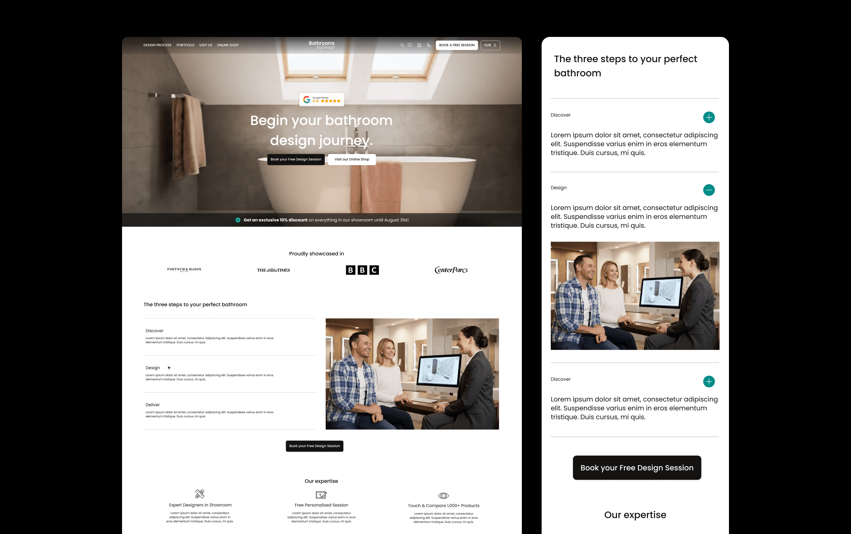
Nous avons refondu le site e-commerce de Bathroom by Design et conçu un espace client associé, réunissant catalogue, service de conception, showrooms, partenariats professionnels et configurateur VR au sein d'une seule plateforme connectée. Malgré la complexité des produits, le résultat est une expérience d'achat et de gestion de projet rassurante et facile à parcourir.
UX/UI & développement
B2C
E-COMMERCE
Bathroom by Design
Nous avons refondu le site e-commerce de Bathroom by Design et conçu un espace client associé, réunissant catalogue, service de conception, showrooms, partenariats professionnels et configurateur VR au sein d'une seule plateforme connectée. Malgré la complexité des produits, le résultat est une expérience d'achat et de gestion de projet rassurante et facile à parcourir.
UX/UI & développement
B2C
E-COMMERCE

Phoenix OCP
Phoenix OCP est le premier répartiteur pharmaceutique de France. Notre studio de design l’accompagne au quotidien sur les réseaux sociaux, la communication interne, le print et l’événementiel. D’un post LinkedIn sur la sécurité à un livret de départ à la retraite, chaque projet reçoit un traitement créatif adapté, ancré dans un système de marque cohérent.
Campagne
B2B
SANTÉ
Phoenix OCP
Phoenix OCP est le premier répartiteur pharmaceutique de France. Notre studio de design l’accompagne au quotidien sur les réseaux sociaux, la communication interne, le print et l’événementiel. D’un post LinkedIn sur la sécurité à un livret de départ à la retraite, chaque projet reçoit un traitement créatif adapté, ancré dans un système de marque cohérent.
Campagne
B2B
SANTÉ

Axiom Stratum
Nous avons créé l'identité de marque et le site d'Axiom Stratum, un cabinet de conseil qui devait inspirer autant de crédibilité que McKinsey ou Blackstone dès le premier contact. Le résultat : un système structuré et affirmé, logo, typographie et site éditorial mono-colonne, ancré dans une palette chaleureuse et terreuse inspirée des racines africaines.
UX/UI & développement
B2B
CONSEIL
Identité de marque
Axiom Stratum
Nous avons créé l'identité de marque et le site d'Axiom Stratum, un cabinet de conseil qui devait inspirer autant de crédibilité que McKinsey ou Blackstone dès le premier contact. Le résultat : un système structuré et affirmé, logo, typographie et site éditorial mono-colonne, ancré dans une palette chaleureuse et terreuse inspirée des racines africaines.
UX/UI & développement
B2B
CONSEIL
Identité de marque

Stella
Nous avons créé l'identité de marque de Stella, un service de rencontre centré sur l'humain, pensé pour des célibataires émotionnellement matures. Le résultat : un système réfléchi et moderne qui distingue Stella de la culture du swipe — chaleureux, crédible, loin du « matchmaker de luxe ».
Identité de marque
B2C
LIFESTYLE
Stella
Nous avons créé l'identité de marque de Stella, un service de rencontre centré sur l'humain, pensé pour des célibataires émotionnellement matures. Le résultat : un système réfléchi et moderne qui distingue Stella de la culture du swipe — chaleureux, crédible, loin du « matchmaker de luxe ».
Identité de marque
B2C
LIFESTYLE

Joiia CBD
Joiia CBD vend ses fleurs, huiles et résines chez les buralistes, et gère deux autres marques pour d’autres rayons : Les Chanvrais en épicerie, Fiore CBD en pharmacie. Nous avons conçu le packaging des trois, chacune avec son propre système.
Identité de marque
B2C
BIEN-ÊTRE
PACKAGING
Joiia CBD
Joiia CBD vend ses fleurs, huiles et résines chez les buralistes, et gère deux autres marques pour d’autres rayons : Les Chanvrais en épicerie, Fiore CBD en pharmacie. Nous avons conçu le packaging des trois, chacune avec son propre système.
Identité de marque
B2C
BIEN-ÊTRE
PACKAGING

Saba Gourmet
Nous avons créé l’identité de Saba Gourmet, une marque gastronomique qui associe des influences nord-africaines à un univers méditerranéen contemporain. Le système relie logo, packaging, print, modèles pour les réseaux sociaux et véhicules de livraison, donnant à l’équipe une identité cohérente pour son lancement sur les points de contact physiques et digitaux.
Identité de marque
B2C
FOOD & BOISSONS
Saba Gourmet
Nous avons créé l’identité de Saba Gourmet, une marque gastronomique qui associe des influences nord-africaines à un univers méditerranéen contemporain. Le système relie logo, packaging, print, modèles pour les réseaux sociaux et véhicules de livraison, donnant à l’équipe une identité cohérente pour son lancement sur les points de contact physiques et digitaux.
Identité de marque
B2C
FOOD & BOISSONS

Boneca
Nous avons réinventé la marque Boneca pour qu'elle résonne avec la scène électro londonienne, en créant une identité audacieuse et engageante qui parle directement à son public B2C. Notre travail a couvert la mise à jour du langage visuel sur les affiches d'événements, les réseaux sociaux et les autres points de contact, pour une marque vibrante, tranchante et cohérente sur toutes les plateformes.
Identité de marque
B2C
Boneca
Nous avons réinventé la marque Boneca pour qu'elle résonne avec la scène électro londonienne, en créant une identité audacieuse et engageante qui parle directement à son public B2C. Notre travail a couvert la mise à jour du langage visuel sur les affiches d'événements, les réseaux sociaux et les autres points de contact, pour une marque vibrante, tranchante et cohérente sur toutes les plateformes.
Identité de marque
B2C