
Boux Avenue
Boux Avenue
A back-to-work lingerie edit, designed as a twenty-page newspaper
Project Overview
Boux Avenue is a British lingerie and sleepwear brand with stores across the UK and a strong online business. For autumn 2023 it had a Back to Work collection, a studio shoot and four interviews with women who run companies, agencies and labs. It did not yet have a format to put them in.
We proposed the newspaper, planned it, art directed it, edited the pictures and the copy with the writer, and took it to print.
Challenges & Objectives
A lingerie catalogue sells product and gets thrown away. Boux Avenue wanted something you keep: the collection next to a conversation about careers, so the lingerie reads as part of a working woman’s week, not a shoot.
Twenty pages, one model, one grey studio, five colourways. It had to feel like a fashion title, not a mailer, and be on the shop counter for the launch of the edit.
Client
Boux Avenue
Industry
Fashion & Lingerie
Services
Editorial Design
Art Direction
Print Production
Timeline
8 weeks
Year
Client
Boux Avenue
Industry
Fashion & Lingerie
Services
Editorial Design
Art Direction
Print Production
Timeline
8 weeks
Year

A Newspaper, Not a Brochure
The brief came with the content, not the format. We showed two routes: a stitched lookbook, and a tabloid newspaper. The newspaper won. It gives four long interviews the room they need, it costs less per page, and it is the one people leave on a desk.
The Flatplan
Twenty pages planned on one sheet before a page was designed. Cover, opener, then a rhythm: fashion, interview, fashion, interview, four times over, and the brand on the back. Every colourway gets its own spread. Every woman gets her own page, facing the collection.
Concept
Concept
A Newspaper, Not a Brochure
The brief came with the content, not the format. We showed two routes: a stitched lookbook, and a tabloid newspaper. The newspaper won. It gives four long interviews the room they need, it costs less per page, and it is the one people leave on a desk.
The Flatplan
Twenty pages planned on one sheet before a page was designed. Cover, opener, then a rhythm: fashion, interview, fashion, interview, four times over, and the brand on the back. Every colourway gets its own spread. Every woman gets her own page, facing the collection.
Concept


Image Selection
The shoot gave us hundreds of frames of one model in one studio. We edited them down to the ones that made the issue: one close-up per colourway, one strip of three looks, the full-length shots for the covers. Cropping did the rest. Tight on the lace, loose on the tailoring.
Luxury in Grey
One grey backdrop, no props until the back cover. The restraint is what makes it feel expensive: the lace is the only colour on the page, the type is small, the margins are wide. The folio runs in a hairline serif on every page. Fashion titles do this. Mailers do not.
Art Direction
Art Direction
Image Selection
The shoot gave us hundreds of frames of one model in one studio. We edited them down to the ones that made the issue: one close-up per colourway, one strip of three looks, the full-length shots for the covers. Cropping did the rest. Tight on the lace, loose on the tailoring.
Luxury in Grey
One grey backdrop, no props until the back cover. The restraint is what makes it feel expensive: the lace is the only colour on the page, the type is small, the margins are wide. The folio runs in a hairline serif on every page. Fashion titles do this. Mailers do not.
Art Direction


Working with the Copywriter
The interviews came in long. We worked through each one with the writer: a standfirst that says who she is in two lines, the questions cut to the ones that carry, and one answer chosen as the pull quote. The edit and the layout were done together, so no page carries text it does not need.
One Template, Four Women
Every interview opens the same way: a portrait top left, the name as the headline, the standfirst in bold, then the questions in three columns and the pull quote set large in italic. The reader learns the pattern on page five. Opposite each interview, the collection takes the full page.
Interviews
Interviews
Working with the Copywriter
The interviews came in long. We worked through each one with the writer: a standfirst that says who she is in two lines, the questions cut to the ones that carry, and one answer chosen as the pull quote. The edit and the layout were done together, so no page carries text it does not need.
One Template, Four Women
Every interview opens the same way: a portrait top left, the name as the headline, the standfirst in bold, then the questions in three columns and the pull quote set large in italic. The reader learns the pattern on page five. Opposite each interview, the collection takes the full page.
Interviews


Paper and Format
We chose the format, the stock and the finish with the printer. A tabloid that folds into a tote bag. A paper with enough weight to carry a full-bleed photograph without showing through, and an uncoated surface so the grey reads matte, like the studio wall.
Print-Ready Files
Full-bleed spreads were checked across the gutter at size, the five reds, blues and teals matched to the lingerie, and the QR codes on the covers tested before plates. Proofs signed off, files delivered, print run on the counter for the launch.


Cover to Back Cover
Twenty pages in order. The cover opens on the shoot’s one prop, a photocopier; the back cover closes on a desk. In between, four interviews and five colourways, one spread each.
What Never Changes
The masthead serif in the folio. The brand sans in the headlines. The pull quote in italic. The grey. From page to page only the colour of the lace and the woman being interviewed change.
The Issue


Deliverables
Format proposal and flatplan
Editorial design: 20 pages, cover to back cover
Fashion art direction and image selection
Copy editing with the writer: standfirsts, cuts, pull quotes
Paper, format and finish with the printer
Print-ready files and proofs
Outcome
The Avenue went out with the Back to Work edit in autumn 2023. Twenty pages, four interviews, five colourways, one template. It reads like a fashion title and sells like a catalogue.
Key results
20
pages, cover to back cover
4
interviews, one template
5
colourways, one spread each
More case studies

Depop
Depop is the fashion marketplace where millions buy and sell secondhand style, and we built its internal design system with the brand team. Sixteen chapters of brand, product and partner guidelines now sit in one searchable place, open to everyone in the company.
UX/UI & DEVELOPMENT
Figma
B2C
FASHION
TECH

Amazon Salon
We shaped the brand identity for Amazon Salon, a hair salon in London's Spitalfields Market pairing a full range of services with the latest salon technology. The result is a modern, sophisticated system spanning logo, signage, website, Instagram, and print, that reads as one coherent brand.
UX/UI & DEVELOPMENT
Brand identity
B2C
Ecom
BEAUTY

Younited
We've been Younited's weekly creative partner since the start, producing marketing campaigns across social, email, and affiliation on a fixed weekly rhythm. The result is a production machine that still gives every week its own idea, roughly ten on-brand assets per campaign, built on a documented brand system, for a fintech that can't afford to compromise on creative.
CAMPAIGN
CRM EMAIL DESIGN
B2C
FINANCE

Busuu
Busuu is one of the best-known names in language learning. We redesigned their B2B website on HubSpot: a marketing site built for L&D leaders, with conversion-first lead capture, long-form content and a CRM email system to match.
UX/UI & DEVELOPMENT
B2B
Edtech
Busuu
Busuu is one of the best-known names in language learning. We redesigned their B2B website on HubSpot: a marketing site built for L&D leaders, with conversion-first lead capture, long-form content and a CRM email system to match.
UX/UI & DEVELOPMENT
B2B
Edtech

Clé de Peau Beauté
We designed a series of campaign pages for Clé de Peau Beauté, turning each luxury skincare launch into its own cinematic, editorial-style story rather than a banner. Three campaigns, Radiant Cream Foundation, Restorative Cream Supreme, and La Crème, each got their own audience and emotional entry point within CPB's existing Figma component system.
UX/UI & DEVELOPMENT
B2C
CAMPAIGN
Luxury
Skincare

Phoenix OCP
Phoenix OCP is France's leading pharmaceutical distributor, and we work as its ongoing design studio partner across social, internal communications, print and events. From a LinkedIn safety post to a retirement magazine, each brief receives a distinct creative treatment grounded in one consistent brand system.
CAMPAIGN
B2B
HEALTH

Jigsaw Avenue
Jigsaw Avenue makes 1000-piece puzzles inspired by contemporary art, made in Britain. We designed the packaging and art directed the photography: a box you choose like a book and keep on show once the puzzle is done.
PACKAGING
B2C
LIFESTYLE
Jigsaw Avenue
Jigsaw Avenue makes 1000-piece puzzles inspired by contemporary art, made in Britain. We designed the packaging and art directed the photography: a box you choose like a book and keep on show once the puzzle is done.
PACKAGING
B2C
LIFESTYLE

Libe
LIBE is a Paris loungewear brand built on comfort, premium materials, and exclusive artistic prints, and we built their full luxury Shopify experience: art direction, UX/UI, development. Editorial storytelling and artist collaborations carry every collection.
UX/UI & DEVELOPMENT
B2C
Luxury
FASHION

Naked Era
We created a refined Shopify experience for NAKED ERA, a feminine swimwear brand built around sun, skin, travel, and effortless confidence. The result is a complete summer universe, logo, typography, website, and campaign templates, translating the brand's Mediterranean mood into a playful, sun-drenched, effortlessly shoppable world.
UX/UI & DEVELOPMENT
B2C
Ecom
FASHION
Brand identity

Zoe Kratzmann
We work as Zoe Kratzmann's ongoing email design partner, running a fashion brand's most direct revenue channel through Figma and Klaviyo. A modular design system and data-informed builds keep every send considered, current, and on-brand, converting without ever looking like a discount offer.
CRM EMAIL DESIGN
B2C
FASHION
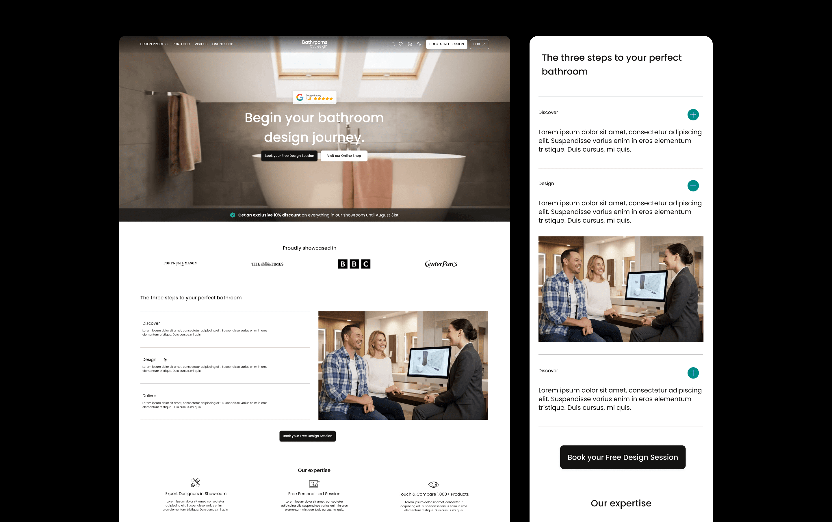
Bathroom by Design
We redesigned Bathroom by Design's e-commerce website and built a companion customer dashboard, bringing their catalogue, design service, showrooms, trade partnerships, and VR configurator into one connected platform. Even though the products themselves are complex, the result is a shopping and project-management experience that feels confident and easy to navigate.
UX/UI & DEVELOPMENT
B2C
Ecom

Axiom Stratum
We built the brand identity and website for Axiom Stratum, a consulting firm that needed to feel as credible as McKinsey or Blackstone from the first interaction. The result is a structured, authoritative system, logo, typography, and an editorial mono-column website, grounded by a warm, earthy palette inspired by African roots.
UX/UI & DEVELOPMENT
B2B
CONSULTING
Brand identity

Stella
We built the brand identity for Stella, a human-first dating service for emotionally mature singles. The result is a thoughtful, modern system that sets Stella apart from swipe culture — warm, credible, and without the luxury-matchmaker feel.
Brand identity
B2C
LIFESTYLE
Stella
We built the brand identity for Stella, a human-first dating service for emotionally mature singles. The result is a thoughtful, modern system that sets Stella apart from swipe culture — warm, credible, and without the luxury-matchmaker feel.
Brand identity
B2C
LIFESTYLE

Joiia CBD
Joiia CBD sells its flowers, oils and resins through tobacconists, and runs two more brands for other shelves: Les Chanvrais in grocers, Fiore CBD in pharmacies. We designed the packaging for all three, each with its own system.
Brand identity
B2C
WELLNESS
PACKAGING
Joiia CBD
Joiia CBD sells its flowers, oils and resins through tobacconists, and runs two more brands for other shelves: Les Chanvrais in grocers, Fiore CBD in pharmacies. We designed the packaging for all three, each with its own system.
Brand identity
B2C
WELLNESS
PACKAGING

Saba Gourmet
We created the brand identity for Saba Gourmet, a gourmet food brand bringing North African influences into a contemporary Mediterranean world. The system connects its logo, packaging, print, social templates and delivery vehicles, giving the team a consistent identity to launch across physical and digital touchpoints.
Brand identity
B2C
FOOD & DRINK

Boneca
We reimagined Boneca’s brand to resonate with the electronic music scene in London, creating an engaging and bold identity that speaks directly to their B2C audience. Our work included updating their visual language across event posters, social media, and other consumer touchpoints, ensuring the brand remains vibrant, edgy, and consistent across all platforms.
Brand identity
B2C