Saba Gourmet
Saba Gourmet
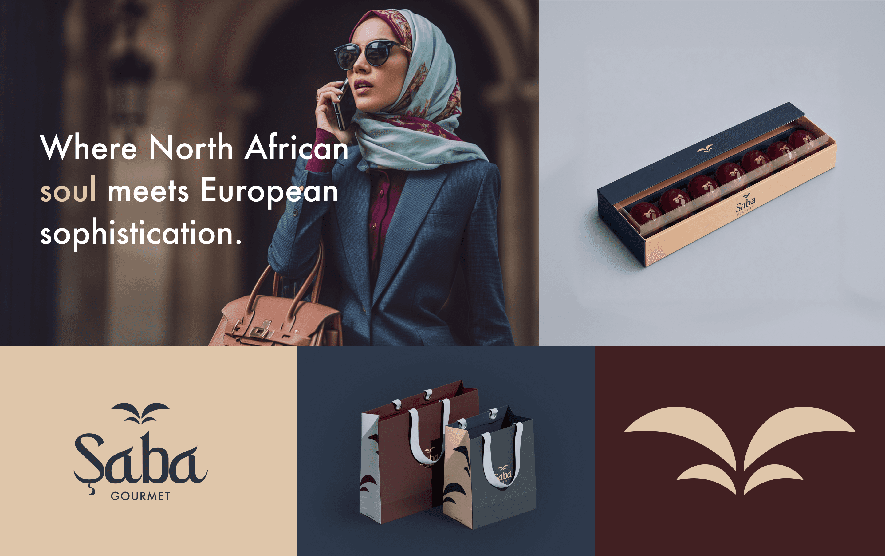
Where North African soul meets European refinement
Project Overview
Saba Gourmet is a gourmet food brand preparing to launch. We approached it as more than a food label. It had to become a sensory world: a place where taste, culture, packaging, and digital experience could work together to express Mediterranean sophistication.
The identity needed to support a wide range of applications, from gourmet packaging and e-commerce to delivery vehicles, printed materials, and premium retail environments. Every element had to communicate the same promise: carefully selected products, responsibly sourced ingredients, and a refined culinary experience inspired by both shores of the Mediterranean.
Challenges & Objectives
The main challenge was to position Saba Gourmet in a competitive premium food landscape while giving it a distinctive cultural point of view.
The brand needed to feel at home beside references such as La Grande Épicerie and Selfridges Food Hall, while carrying a more intimate and emotionally rich narrative. We had to avoid clichés often associated with North African visual culture and instead create a contemporary identity built on subtle symbolism, warm restraint, and premium execution.
Client
Saba Gourmet
Industry
Food & Beverage
Services
Branding
Graphic Design
Merchandising
Timeline
6 weeks
Year
Client
Saba Gourmet
Industry
Food & Beverage
Services
Branding
Graphic Design
Merchandising
Timeline
6 weeks
Year
Logo Design
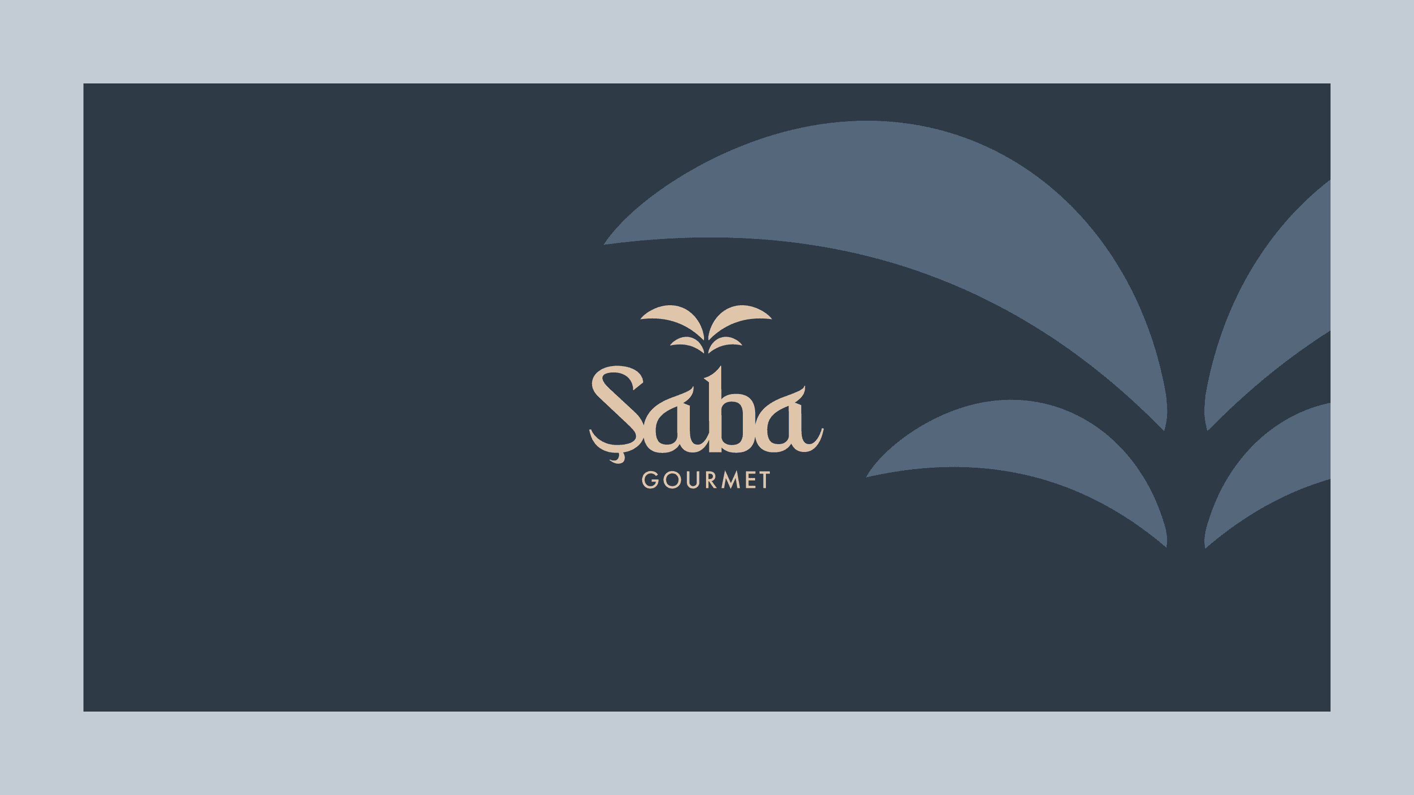
The Saba Gourmet logo was designed as a refined emblem, combining cultural resonance with premium simplicity. The symbol evokes a bird in motion, an open gesture, and the softness of Mediterranean landscapes. It suggests travel, exchange, and generosity — key ideas behind a brand built around culinary dialogue.
Pattern Design
The visual system extends the logo into a soft, architectural pattern inspired by movement, wings, palms, and Mediterranean horizons.
Colour Palette
The colour palette was created to express warmth, confidence, and discretion. Deep navy anchors the brand with sophistication and trust. Burgundy introduces richness, appetite, and depth. Soft beige brings natural warmth — grains, spices, Mediterranean light. Pale blue adds freshness, balance, and a sense of openness.

Implementation
The identity system was designed to be highly adaptable across physical and digital environments. On packaging, the brand feels premium and tactile, with generous spacing, refined contrast, and clear product hierarchy. On digital screens, the system becomes editorial and immersive, allowing food photography, product storytelling, and e-commerce content to work together. On delivery vehicles, the oversized pattern creates strong street presence while keeping the brand elevated and minimal.


Poster Design
The poster direction combines atmospheric photography, elegant typography, and concise messaging. Instead of presenting products as simple goods, the visuals frame them as part of a lifestyle: intentional, cultured, and sensorial.
Social Media Templates
For social media, we created a flexible visual language that can support product launches, ingredient stories, seasonal campaigns, recipes, and editorial content.
Merchandising
The merchandising applications were designed to extend the Saba experience beyond purchase. Shopping bags, packaging, boxes, and branded materials turn each interaction into a ritual of presentation. The visual identity reinforces a sense of care and curation, making the customer feel that every product has been selected, packed, and delivered with intention.

Deliverables
Logo and emblem suite (primary, secondary, monochrome)
Brand pattern system
Colour and typography system
Packaging design
Poster and print design
Social media templates
Merchandising (shopping bags, boxes, branded materials)
Delivery vehicle livery
Outcome
In six weeks, Saba Gourmet gained a complete identity spanning eight deliverable groups: logo and emblem, pattern, colour and typography, packaging, print, social templates, merchandising and vehicle livery. The team now has a shared visual system for preparing its launch, with consistent applications from product packaging to delivery. The completed work provides the assets needed to introduce the brand across physical and digital channels.
Key results
6
weeks, from brief to brand identity
8
groups of brand deliverables
4
applications, from packaging to vehicles
More case studies

Depop
Depop is the fashion marketplace where millions buy and sell secondhand style, and we built its internal design system with the brand team. Sixteen chapters of brand, product and partner guidelines now sit in one searchable place, open to everyone in the company.
UX/UI & DEVELOPMENT
Figma
B2C
FASHION
TECH

Clé de Peau Beauté
We designed a series of campaign pages for Clé de Peau Beauté, turning each luxury skincare launch into its own cinematic, editorial-style story rather than a banner. Three campaigns, Radiant Cream Foundation, Restorative Cream Supreme, and La Crème, each got their own audience and emotional entry point within CPB's existing Figma component system.
UX/UI & DEVELOPMENT
B2C
CAMPAIGN
Luxury
Skincare
Libe
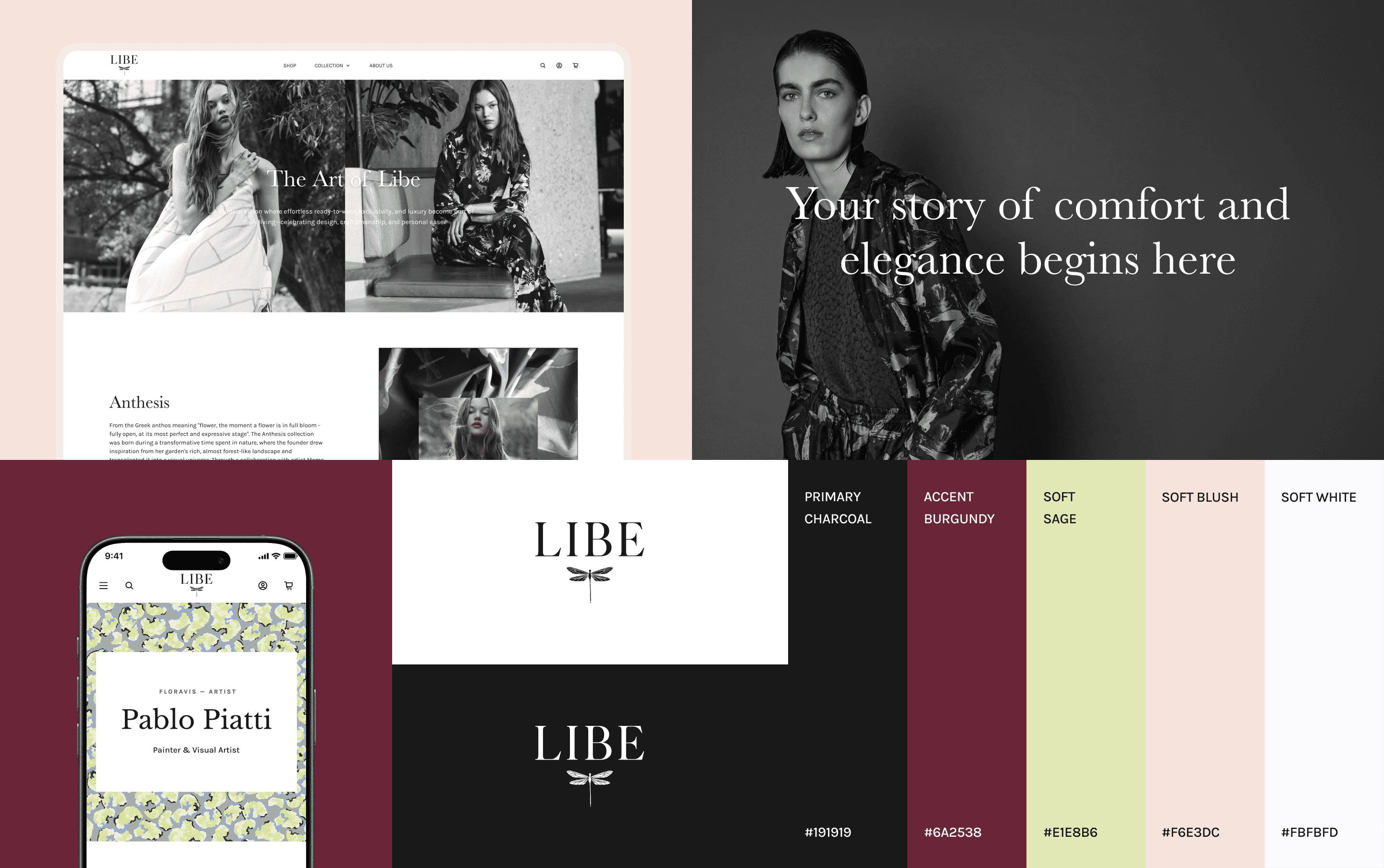
LIBE is a Paris loungewear brand built on comfort, premium materials, and exclusive artistic prints, and we built their full luxury Shopify experience: art direction, UX/UI, development. Editorial storytelling and artist collaborations carry every collection.
UX/UI & DEVELOPMENT
B2C
Luxury
FASHION

Naked Era
We created a refined Shopify experience for NAKED ERA, a feminine swimwear brand built around sun, skin, travel, and effortless confidence. The result is a complete summer universe, logo, typography, website, and campaign templates, translating the brand's Mediterranean mood into a playful, sun-drenched, effortlessly shoppable world.
UX/UI & DEVELOPMENT
B2C
Ecom
FASHION
Brand identity

Zoe Kratzmann
We work as Zoe Kratzmann's ongoing email design partner, running a fashion brand's most direct revenue channel through Figma and Klaviyo. A modular design system and data-informed builds keep every send considered, current, and on-brand, converting without ever looking like a discount offer.
CRM EMAIL DESIGN
B2C
FASHION

Amazon Salon
We shaped the brand identity for Amazon Salon, a hair salon in London's Spitalfields Market pairing a full range of services with the latest salon technology. The result is a modern, sophisticated system spanning logo, signage, website, Instagram, and print, that reads as one coherent brand.
UX/UI & DEVELOPMENT
Brand identity
B2C
Ecom
BEAUTY

Busuu
Busuu is one of the best-known names in language learning. We redesigned their B2B website on HubSpot: a marketing site built for L&D leaders, with conversion-first lead capture, long-form content and a CRM email system to match.
UX/UI & DEVELOPMENT
B2B
Edtech
Busuu
Busuu is one of the best-known names in language learning. We redesigned their B2B website on HubSpot: a marketing site built for L&D leaders, with conversion-first lead capture, long-form content and a CRM email system to match.
UX/UI & DEVELOPMENT
B2B
Edtech

Younited
We've been Younited's weekly creative partner since the start, producing marketing campaigns across social, email, and affiliation on a fixed weekly rhythm. The result is a production machine that still gives every week its own idea, roughly ten on-brand assets per campaign, built on a documented brand system, for a fintech that can't afford to compromise on creative.
CAMPAIGN
CRM EMAIL DESIGN
B2C
FINANCE

Bathroom by Design
We redesigned Bathroom by Design's e-commerce website and built a companion customer dashboard, bringing their catalogue, design service, showrooms, trade partnerships, and VR configurator into one connected platform. Even though the products themselves are complex, the result is a shopping and project-management experience that feels confident and easy to navigate.
UX/UI & DEVELOPMENT
B2C
Ecom

Phoenix OCP
Phoenix OCP is France's leading pharmaceutical distributor, and we work as its ongoing design studio partner across social, internal communications, print and events. From a LinkedIn safety post to a retirement magazine, each brief receives a distinct creative treatment grounded in one consistent brand system.
CAMPAIGN
B2B
HEALTH

Axiom Stratum
We built the brand identity and website for Axiom Stratum, a consulting firm that needed to feel as credible as McKinsey or Blackstone from the first interaction. The result is a structured, authoritative system, logo, typography, and an editorial mono-column website, grounded by a warm, earthy palette inspired by African roots.
UX/UI & DEVELOPMENT
B2B
CONSULTING
Brand identity

Stella
We built the brand identity for Stella, a human-first dating service for emotionally mature singles. The result is a thoughtful, modern system that sets Stella apart from swipe culture — warm, credible, and without the luxury-matchmaker feel.
Brand identity
B2C
LIFESTYLE
Stella
We built the brand identity for Stella, a human-first dating service for emotionally mature singles. The result is a thoughtful, modern system that sets Stella apart from swipe culture — warm, credible, and without the luxury-matchmaker feel.
Brand identity
B2C
LIFESTYLE