

Phoenix Student
Phoenix Student
The same company, in a softer voice: an identity to bring pharmacy students in
Project Overview
PHOENIX OCP is France's leading pharmaceutical distributor, delivering three million medicines a day. Its brand is built for that scale and for the pharmacies it serves. Pharmacy students are a different audience and needed a voice of their own.
So we gave PHOENIX OCP a second identity, made only for students. Same logo, same green at its heart, then everything around it softened: pastel colours, a hand-written script, rounded shapes, warm portraits. Posters, flyers, a presentation, a leaflet and social templates, all built to live in faculties and at student forums and to make a future pharmacist stop, smile and ask what the job is.
Challenges & Objectives
Most pharmacy students have never heard of pharmaceutical distribution. The profession sits between the faculty and the counter, and nobody talks about it. PHOENIX OCP wanted to be the one who does and to recruit.
The corporate brand speaks to pharmacies and partners, in a register made for them. Students needed something else: an identity that feels light, warm and current, and still belongs to a leader in healthcare. It had to be young without trying too hard. No campus clichés, nothing childish.
Phoenix Student
The same company, in a softer voice: an identity to bring pharmacy students in
Project Overview
PHOENIX OCP is France's leading pharmaceutical distributor, delivering three million medicines a day. Its brand is built for that scale and for the pharmacies it serves. Pharmacy students are a different audience and needed a voice of their own.
So we gave PHOENIX OCP a second identity, made only for students. Same logo, same green at its heart, then everything around it softened: pastel colours, a hand-written script, rounded shapes, warm portraits. Posters, flyers, a presentation, a leaflet and social templates, all built to live in faculties and at student forums and to make a future pharmacist stop, smile and ask what the job is.
Challenges & Objectives
Most pharmacy students have never heard of pharmaceutical distribution. The profession sits between the faculty and the counter, and nobody talks about it. PHOENIX OCP wanted to be the one who does and to recruit.
The corporate brand speaks to pharmacies and partners, in a register made for them. Students needed something else: an identity that feels light, warm and current, and still belongs to a leader in healthcare. It had to be young without trying too hard. No campus clichés, nothing childish.
Client
Phoenix Student
Industry
Healthcare & Pharma
Services
Branding
Art Direction
Brand Guidelines
Timeline
8 weeks
Year
Client
Phoenix Student
Industry
Healthcare & Pharma
Services
Branding
Art Direction
Brand Guidelines
Timeline
8 weeks
Year

Our Approach
We kept the green and softened everything around it. This identity is gentle and leaves air on the page. We set the rhythm before we drew a single element: shorter lines, bigger words, one idea at a time, and a script voice that breaks the capitals like a smile breaks a formal face.
Every layout was tested on one scene: a student forum, thirty stands, three seconds of attention. If it didn't read from five meters away and didn't feel kind up close it didn't stay.
Logo
The PHOENIX OCP logo belongs to the group. We left its drawing and lockup untouched and built the student identity around it.
Design System
Design System
Our Approach
We kept the green and softened everything around it. This identity is gentle and leaves air on the page. We set the rhythm before we drew a single element: shorter lines, bigger words, one idea at a time, and a script voice that breaks the capitals like a smile breaks a formal face.
Every layout was tested on one scene: a student forum, thirty stands, three seconds of attention. If it didn't read from five meters away and didn't feel kind up close it didn't stay.
Logo
The PHOENIX OCP logo belongs to the group. We left its drawing and lockup untouched and built the student identity around it.
Design System


Typography
Two typefaces, deliberately mismatched. Ticdar is the primary: a rounded, friendly sans in four weights, set big sometimes very big. Borthans is the secondary: a brush script that looks written by hand, kept for the human part of the message.
The pairing is the whole identity in miniature. "LEADER DE LA RÉPARTITION PHARMACEUTIQUE EN FRANCE" in confident capitals across the width; underneath, in script, "Parce que la santé évolue, votre carrière aussi". The institution, then the person. Key words are scaled up, cropped or highlighted so a poster reads in one glance, and the script gives every layout its softness.
Colour Palette
Six colours, three and three. From the group: Phoenix Deep Green, Sage Green, Soft Yellow. New, and pastel: Ice Blue, Coral, Dusty Rose.
The pastels set the mood. They lighten the green, make the identity warm and current, and separate student communication from corporate communication at a glance. Nothing shouts: the contrast comes from the pairings Deep Green on Dusty Rose, Coral on Soft Yellow, script over Ice Blue not from the volume.
Typography
Two typefaces, deliberately mismatched. Ticdar is the primary: a rounded, friendly sans in four weights, set big sometimes very big. Borthans is the secondary: a brush script that looks written by hand, kept for the human part of the message.
The pairing is the whole identity in miniature. "LEADER DE LA RÉPARTITION PHARMACEUTIQUE EN FRANCE" in confident capitals across the width; underneath, in script, "Parce que la santé évolue, votre carrière aussi". The institution, then the person. Key words are scaled up, cropped or highlighted so a poster reads in one glance, and the script gives every layout its softness.
Colour Palette
Six colours, three and three. From the group: Phoenix Deep Green, Sage Green, Soft Yellow. New, and pastel: Ice Blue, Coral, Dusty Rose.
The pastels set the mood. They lighten the green, make the identity warm and current, and separate student communication from corporate communication at a glance. Nothing shouts: the contrast comes from the pairings Deep Green on Dusty Rose, Coral on Soft Yellow, script over Ice Blue not from the volume.


Graphic Language
Curves, never corners. A small family of shapes rounded panels, tabs, scalloped badges, a hand-drawn arrow frames photography and holds text without boxing it in. Portraits are cut out and overlap the shapes, so people come forward and the page gets depth.
One line runs through everything: "De l'amphi à l'officine" from the lecture hall to the pharmacy. Repeated, stacked, finished in script, it became a graphic element in its own right. Photography is warm and natural: students, young pharmacists, white coats and big smiles.
Presentation
The student presentation is where the identity does its real job: explaining a profession in fifteen minutes to a lecture hall that has never heard of it. We rebuilt it as a story "Dans les coulisses de la distribution des produits de santé" in fourteen slides.
One idea per slide, one colour per chapter. Figures are set huge and left alone: 57 sites, 3 million medicines a day, 24 hours to deliver, -80% carbon on inbound flows. The four public service obligations become four cards, the network becomes a map of France, and the deck turns coral for one slide "PHOENIX OCP recrute" before closing on the two ways in: the master's in Limoges and the Pharm'Academy.
Graphic Language
Curves, never corners. A small family of shapes rounded panels, tabs, scalloped badges, a hand-drawn arrow frames photography and holds text without boxing it in. Portraits are cut out and overlap the shapes, so people come forward and the page gets depth.
One line runs through everything: "De l'amphi à l'officine" from the lecture hall to the pharmacy. Repeated, stacked, finished in script, it became a graphic element in its own right. Photography is warm and natural: students, young pharmacists, white coats and big smiles.
Presentation
The student presentation is where the identity does its real job: explaining a profession in fifteen minutes to a lecture hall that has never heard of it. We rebuilt it as a story "Dans les coulisses de la distribution des produits de santé" in fourteen slides.
One idea per slide, one colour per chapter. Figures are set huge and left alone: 57 sites, 3 million medicines a day, 24 hours to deliver, -80% carbon on inbound flows. The four public service obligations become four cards, the network becomes a map of France, and the deck turns coral for one slide "PHOENIX OCP recrute" before closing on the two ways in: the master's in Limoges and the Pharm'Academy.


Print Templates
Print is where a student meets PHOENIX OCP first: on a faculty noticeboard, at a forum stand, in a hand. Every format is built as a template. The team swaps a portrait, updates a figure or changes a date, and the layout holds.
Posters & Flyers
A person first, the facts second. "PHOENIX OCP recrute les pharmaciens de demain" in capitals and script, two key figures across the top, one QR code in the corner. Two versions, one structure, pinned up in faculties.
Print Templates
Print is where a student meets PHOENIX OCP first: on a faculty noticeboard, at a forum stand, in a hand. Every format is built as a template. The team swaps a portrait, updates a figure or changes a date, and the layout holds.
Posters & Flyers
A person first, the facts second. "PHOENIX OCP recrute les pharmaciens de demain" in capitals and script, two key figures across the top, one QR code in the corner. Two versions, one structure, pinned up in faculties.

Social Media
On social, each post carries one message. "Nos opportunités" in three steps. One key figure, set huge. "Votre avenir commence ici", with a smiling portrait. Same pastels and same rounded shapes as the print, sized for the feed.
Templates
The templates work as a set: "Évoluez. Explorez. Avancez.", "Pharmaciens de demain", "Futurs pharmaciens", "PHOENIX OCP recrute". The team drops in a photo and a line, and the post is ready. Enough variety to run a full academic year.
Social Media
On social, each post carries one message. "Nos opportunités" in three steps. One key figure, set huge. "Votre avenir commence ici", with a smiling portrait. Same pastels and same rounded shapes as the print, sized for the feed.
Templates
The templates work as a set: "Évoluez. Explorez. Avancez.", "Pharmaciens de demain", "Futurs pharmaciens", "PHOENIX OCP recrute". The team drops in a photo and a line, and the post is ready. Enough variety to run a full academic year.


Brand Elements
Three small marks sign everything: a tab that carries "Leader de la répartition pharmaceutique en France", a scalloped badge and a label written in script. They sit in the corner of a poster or a post, and they work in every colour of the palette.
Stickers
Then they became stickers. Six of them, one for each colour, because at a student fair the thing that ends up on a laptop wins.
Brand Elements
Three small marks sign everything: a tab that carries "Leader de la répartition pharmaceutique en France", a scalloped badge and a label written in script. They sit in the corner of a poster or a post, and they work in every colour of the palette.
Stickers
Then they became stickers. Six of them, one for each colour, because at a student fair the thing that ends up on a laptop wins.


Leaflet
The fold-out leaflet is what a student takes home, so it had to work at the bottom of a tote bag as well as on a table. One colour per panel Ice Blue cover, Deep Green contact, Dusty Rose key figures, Coral careers, Soft Yellow master's. Unfolded, it reads like the palette itself.
The cover carries the promise "Futurs pharmaciens, votre avenir commence ici" with a student cut out over the type. Inside, headings pair Ticdar capitals with one word in script, the QR code sits in a scalloped badge, and the copy is cut to what someone actually reads between two lectures.
Applications
Put together, the pieces work as one kit. A student sees the poster in the faculty, the post in their feed, the stand at the forum and the leaflet in their bag. Different formats, same voice. And because everything is built as a template, the team adds the next piece itself.
Leaflet
The fold-out leaflet is what a student takes home, so it had to work at the bottom of a tote bag as well as on a table. One colour per panel Ice Blue cover, Deep Green contact, Dusty Rose key figures, Coral careers, Soft Yellow master's. Unfolded, it reads like the palette itself.
The cover carries the promise "Futurs pharmaciens, votre avenir commence ici" with a student cut out over the type. Inside, headings pair Ticdar capitals with one word in script, the QR code sits in a scalloped badge, and the copy is cut to what someone actually reads between two lectures.
Applications
Put together, the pieces work as one kit. A student sees the poster in the faculty, the post in their feed, the stand at the forum and the leaflet in their bag. Different formats, same voice. And because everything is built as a template, the team adds the next piece itself.

Deliverables
Student identity concept and moodboard
Colour palette: three group colours, three new pastels
Typography system: Ticdar and Borthans
Graphic elements: shapes, badges, arrows, pattern
Tagline lockup: "De l'amphi à l'officine"
Photography direction
Brand guideline
Student presentation, 14 slides
Fold-out leaflet
Posters, flyers, social media templates, stickers
Outcome
PHOENIX OCP now speaks two ways. The corporate voice for pharmacies and partners; a softer, pastel, hand-written one for the pharmacists of tomorrow. Side by side, you'd know they're the same company and you'd never mistake one for the other.
The team has a guideline and templates it can run without us, from the first forum of the year to the last post of the term. And a student walking past the stand now sees something made for them: a partner from the lecture hall to the pharmacy.
Deliverables
Student identity concept and moodboard
Colour palette: three group colours, three new pastels
Typography system: Ticdar and Borthans
Graphic elements: shapes, badges, arrows, pattern
Tagline lockup: "De l'amphi à l'officine"
Photography direction
Brand guideline
Student presentation, 14 slides
Fold-out leaflet
Posters, flyers, social media templates, stickers
Outcome
PHOENIX OCP now speaks two ways. The corporate voice for pharmacies and partners; a softer, pastel, hand-written one for the pharmacists of tomorrow. Side by side, you'd know they're the same company and you'd never mistake one for the other.
The team has a guideline and templates it can run without us, from the first forum of the year to the last post of the term. And a student walking past the stand now sees something made for them: a partner from the lecture hall to the pharmacy.
More case studies

Jigsaw Avenue
Jigsaw Avenue makes 1000-piece puzzles inspired by contemporary art, made in Britain. We designed the packaging and art directed the photography: a box you choose like a book and keep on show once the puzzle is done.
PACKAGING
B2C
LIFESTYLE
Jigsaw Avenue
Jigsaw Avenue makes 1000-piece puzzles inspired by contemporary art, made in Britain. We designed the packaging and art directed the photography: a box you choose like a book and keep on show once the puzzle is done.
PACKAGING
B2C
LIFESTYLE

Depop
Depop is the fashion marketplace where millions buy and sell secondhand style, and we built its internal design system with the brand team. Sixteen chapters of brand, product and partner guidelines now sit in one searchable place, open to everyone in the company.
UX/UI & DEVELOPMENT
Figma
B2C
FASHION
TECH
Depop
Depop is the fashion marketplace where millions buy and sell secondhand style, and we built its internal design system with the brand team. Sixteen chapters of brand, product and partner guidelines now sit in one searchable place, open to everyone in the company.
UX/UI & DEVELOPMENT
Figma
B2C
FASHION
TECH

Clé de Peau Beauté
We designed a series of campaign pages for Clé de Peau Beauté, turning each luxury skincare launch into its own cinematic, editorial-style story rather than a banner. Three campaigns, Radiant Cream Foundation, Restorative Cream Supreme, and La Crème, each got their own audience and emotional entry point within CPB's existing Figma component system.
UX/UI & DEVELOPMENT
B2C
CAMPAIGN
Luxury
Skincare
Clé de Peau Beauté
We designed a series of campaign pages for Clé de Peau Beauté, turning each luxury skincare launch into its own cinematic, editorial-style story rather than a banner. Three campaigns, Radiant Cream Foundation, Restorative Cream Supreme, and La Crème, each got their own audience and emotional entry point within CPB's existing Figma component system.
UX/UI & DEVELOPMENT
B2C
CAMPAIGN
Luxury
Skincare

Libe
LIBE is a Paris loungewear brand built on comfort, premium materials, and exclusive artistic prints, and we built their full luxury Shopify experience: art direction, UX/UI, development. Editorial storytelling and artist collaborations carry every collection.
UX/UI & DEVELOPMENT
B2C
Luxury
FASHION
Libe
LIBE is a Paris loungewear brand built on comfort, premium materials, and exclusive artistic prints, and we built their full luxury Shopify experience: art direction, UX/UI, development. Editorial storytelling and artist collaborations carry every collection.
UX/UI & DEVELOPMENT
B2C
Luxury
FASHION

Naked Era
We created a refined Shopify experience for NAKED ERA, a feminine swimwear brand built around sun, skin, travel, and effortless confidence. The result is a complete summer universe, logo, typography, website, and campaign templates, translating the brand's Mediterranean mood into a playful, sun-drenched, effortlessly shoppable world.
UX/UI & DEVELOPMENT
B2C
Ecom
FASHION
Brand identity
Naked Era
We created a refined Shopify experience for NAKED ERA, a feminine swimwear brand built around sun, skin, travel, and effortless confidence. The result is a complete summer universe, logo, typography, website, and campaign templates, translating the brand's Mediterranean mood into a playful, sun-drenched, effortlessly shoppable world.
UX/UI & DEVELOPMENT
B2C
Ecom
FASHION
Brand identity

Zoe Kratzmann
We work as Zoe Kratzmann's ongoing email design partner, running a fashion brand's most direct revenue channel through Figma and Klaviyo. A modular design system and data-informed builds keep every send considered, current, and on-brand, converting without ever looking like a discount offer.
CRM EMAIL DESIGN
B2C
FASHION
Zoe Kratzmann
We work as Zoe Kratzmann's ongoing email design partner, running a fashion brand's most direct revenue channel through Figma and Klaviyo. A modular design system and data-informed builds keep every send considered, current, and on-brand, converting without ever looking like a discount offer.
CRM EMAIL DESIGN
B2C
FASHION

Amazon Salon
We shaped the brand identity for Amazon Salon, a hair salon in London's Spitalfields Market pairing a full range of services with the latest salon technology. The result is a modern, sophisticated system spanning logo, signage, website, Instagram, and print, that reads as one coherent brand.
UX/UI & DEVELOPMENT
Brand identity
B2C
Ecom
BEAUTY
Amazon Salon
We shaped the brand identity for Amazon Salon, a hair salon in London's Spitalfields Market pairing a full range of services with the latest salon technology. The result is a modern, sophisticated system spanning logo, signage, website, Instagram, and print, that reads as one coherent brand.
UX/UI & DEVELOPMENT
Brand identity
B2C
Ecom
BEAUTY

Busuu
Busuu is one of the best-known names in language learning. We redesigned their B2B website on HubSpot: a marketing site built for L&D leaders, with conversion-first lead capture, long-form content and a CRM email system to match.
UX/UI & DEVELOPMENT
B2B
Edtech
Busuu
Busuu is one of the best-known names in language learning. We redesigned their B2B website on HubSpot: a marketing site built for L&D leaders, with conversion-first lead capture, long-form content and a CRM email system to match.
UX/UI & DEVELOPMENT
B2B
Edtech

Younited
We've been Younited's weekly creative partner since the start, producing marketing campaigns across social, email, and affiliation on a fixed weekly rhythm. The result is a production machine that still gives every week its own idea, roughly ten on-brand assets per campaign, built on a documented brand system, for a fintech that can't afford to compromise on creative.
CAMPAIGN
CRM EMAIL DESIGN
B2C
FINANCE
Younited
We've been Younited's weekly creative partner since the start, producing marketing campaigns across social, email, and affiliation on a fixed weekly rhythm. The result is a production machine that still gives every week its own idea, roughly ten on-brand assets per campaign, built on a documented brand system, for a fintech that can't afford to compromise on creative.
CAMPAIGN
CRM EMAIL DESIGN
B2C
FINANCE
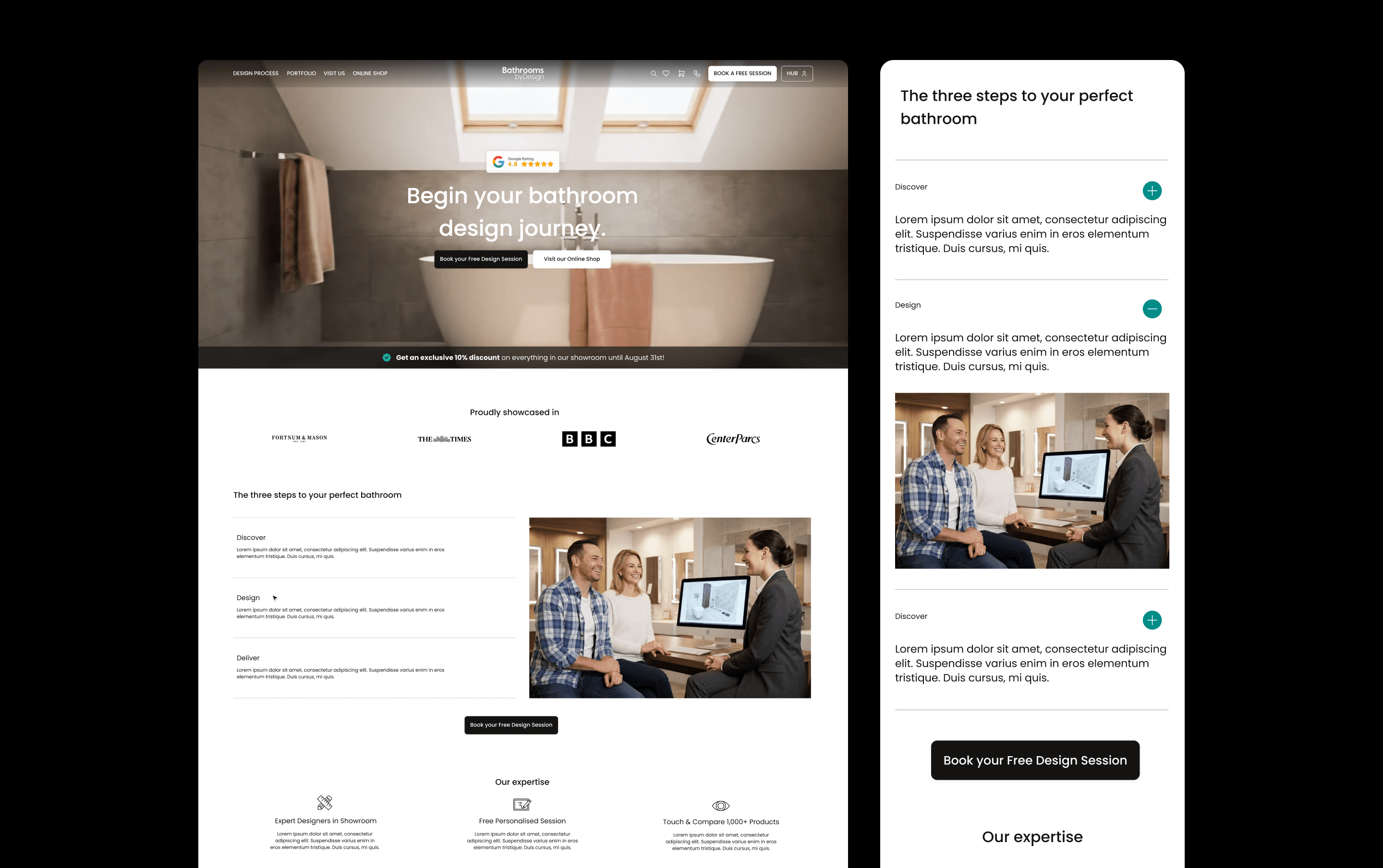
Bathroom by Design
We redesigned Bathroom by Design's e-commerce website and built a companion customer dashboard, bringing their catalogue, design service, showrooms, trade partnerships, and VR configurator into one connected platform. Even though the products themselves are complex, the result is a shopping and project-management experience that feels confident and easy to navigate.
UX/UI & DEVELOPMENT
B2C
Ecom
Bathroom by Design
We redesigned Bathroom by Design's e-commerce website and built a companion customer dashboard, bringing their catalogue, design service, showrooms, trade partnerships, and VR configurator into one connected platform. Even though the products themselves are complex, the result is a shopping and project-management experience that feels confident and easy to navigate.
UX/UI & DEVELOPMENT
B2C
Ecom

Phoenix OCP
Phoenix OCP is France's leading pharmaceutical distributor, and we work as its ongoing design studio partner across social, internal communications, print and events. From a LinkedIn safety post to a retirement magazine, each brief receives a distinct creative treatment grounded in one consistent brand system.
CAMPAIGN
B2B
HEALTH
Phoenix OCP
Phoenix OCP is France's leading pharmaceutical distributor, and we work as its ongoing design studio partner across social, internal communications, print and events. From a LinkedIn safety post to a retirement magazine, each brief receives a distinct creative treatment grounded in one consistent brand system.
CAMPAIGN
B2B
HEALTH

Axiom Stratum
We built the brand identity and website for Axiom Stratum, a consulting firm that needed to feel as credible as McKinsey or Blackstone from the first interaction. The result is a structured, authoritative system, logo, typography, and an editorial mono-column website, grounded by a warm, earthy palette inspired by African roots.
UX/UI & DEVELOPMENT
B2B
CONSULTING
Brand identity
Axiom Stratum
We built the brand identity and website for Axiom Stratum, a consulting firm that needed to feel as credible as McKinsey or Blackstone from the first interaction. The result is a structured, authoritative system, logo, typography, and an editorial mono-column website, grounded by a warm, earthy palette inspired by African roots.
UX/UI & DEVELOPMENT
B2B
CONSULTING
Brand identity

Stella
We built the brand identity for Stella, a human-first dating service for emotionally mature singles. The result is a thoughtful, modern system that sets Stella apart from swipe culture — warm, credible, and without the luxury-matchmaker feel.
Brand identity
B2C
LIFESTYLE
Stella
We built the brand identity for Stella, a human-first dating service for emotionally mature singles. The result is a thoughtful, modern system that sets Stella apart from swipe culture — warm, credible, and without the luxury-matchmaker feel.
Brand identity
B2C
LIFESTYLE

Joiia CBD
Joiia CBD sells its flowers, oils and resins through tobacconists, and runs two more brands for other shelves: Les Chanvrais in grocers, Fiore CBD in pharmacies. We designed the packaging for all three, each with its own system.
Brand identity
B2C
WELLNESS
PACKAGING
Joiia CBD
Joiia CBD sells its flowers, oils and resins through tobacconists, and runs two more brands for other shelves: Les Chanvrais in grocers, Fiore CBD in pharmacies. We designed the packaging for all three, each with its own system.
Brand identity
B2C
WELLNESS
PACKAGING

Saba Gourmet
We created the brand identity for Saba Gourmet, a gourmet food brand bringing North African influences into a contemporary Mediterranean world. The system connects its logo, packaging, print, social templates and delivery vehicles, giving the team a consistent identity to launch across physical and digital touchpoints.
Brand identity
B2C
FOOD & DRINK
Saba Gourmet
We created the brand identity for Saba Gourmet, a gourmet food brand bringing North African influences into a contemporary Mediterranean world. The system connects its logo, packaging, print, social templates and delivery vehicles, giving the team a consistent identity to launch across physical and digital touchpoints.
Brand identity
B2C
FOOD & DRINK

Boneca
We reimagined Boneca’s brand to resonate with the electronic music scene in London, creating an engaging and bold identity that speaks directly to their B2C audience. Our work included updating their visual language across event posters, social media, and other consumer touchpoints, ensuring the brand remains vibrant, edgy, and consistent across all platforms.
Brand identity
B2C
Boneca
We reimagined Boneca’s brand to resonate with the electronic music scene in London, creating an engaging and bold identity that speaks directly to their B2C audience. Our work included updating their visual language across event posters, social media, and other consumer touchpoints, ensuring the brand remains vibrant, edgy, and consistent across all platforms.
Brand identity
B2C