

Matchesfashion
Matchesfashion
Two wardrobes, two art directions, one inbox: editorial email for Matchesfashion
Project Overview
Matchesfashion is a London luxury retailer with an editorial arm, The Style Report, and two audiences that do not read the same way: menswear and womenswear.
We designed the campaign emails for both, as part of the agency team on the account. The weekly menswear briefing, the womenswear tastemaker edits and designer round-ups, desktop and mobile, with Matchesfashion's editorial team on content, its copywriter on headlines and its developer on the build.
Challenges & Objectives
One brand, two readers. The men's email had to be a weekend read, direct and shoppable in a scroll. The women's had to feel like a magazine, with the retailer's serif, pull quotes and tastemakers, and still sell every piece on the page.
The inbox sets its own rules. A luxury email that is one tall image loads slowly, clips in Gmail and lands in promotions. Every layout had to look like print and behave like a web page: light, live text where it counts, every image with a job.
Matchesfashion
Two wardrobes, two art directions, one inbox: editorial email for Matchesfashion
Project Overview
Matchesfashion is a London luxury retailer with an editorial arm, The Style Report, and two audiences that do not read the same way: menswear and womenswear.
We designed the campaign emails for both, as part of the agency team on the account. The weekly menswear briefing, the womenswear tastemaker edits and designer round-ups, desktop and mobile, with Matchesfashion's editorial team on content, its copywriter on headlines and its developer on the build.
Challenges & Objectives
One brand, two readers. The men's email had to be a weekend read, direct and shoppable in a scroll. The women's had to feel like a magazine, with the retailer's serif, pull quotes and tastemakers, and still sell every piece on the page.
The inbox sets its own rules. A luxury email that is one tall image loads slowly, clips in Gmail and lands in promotions. Every layout had to look like print and behave like a web page: light, live text where it counts, every image with a job.
Client
Matchesfashion
Industry
Luxury Fashion
Services
CRM Email Design
Art Direction
Timeline
12 weeks
Year
Client
Matchesfashion
Industry
Luxury Fashion
Services
CRM Email Design
Art Direction
Timeline
12 weeks
Year
Two Art Directions
Menswear
Bold sans-serif, black numerals, a numbered run of five. The Saturday Style Briefing opens on a collage, art, a portrait, a sculpture, then counts down: the shoot, the culture report, the luxury essential of the week, the hero piece, the label focus. Four products under each story, one black link to shop.
Womenswear
Didone serif, italic quotes, a signature. Shop With… hands the email to one tastemaker and twelve looks: three shown in full, each with its quote and its four pieces. 6 Designers to Wear Now sets a white serif numeral over each image, two per row, one line per label.
Design
Design
Two Art Directions
Menswear
Bold sans-serif, black numerals, a numbered run of five. The Saturday Style Briefing opens on a collage, art, a portrait, a sculpture, then counts down: the shoot, the culture report, the luxury essential of the week, the hero piece, the label focus. Four products under each story, one black link to shop.
Womenswear
Didone serif, italic quotes, a signature. Shop With… hands the email to one tastemaker and twelve looks: three shown in full, each with its quote and its four pieces. 6 Designers to Wear Now sets a white serif numeral over each image, two per row, one line per label.
Design


Content and Layout
Content Selection
Every email started with the editorial calendar. The Style Report team set the stories, the buyers set the products, we chose the images: the one portrait that carries a hero, the four pieces that read as a look at 150 pixels wide. Nothing on the page without a reason to click.
The Grid
One 600-pixel grid, modular: hero, numbered story, four-product row, split tile, promo bar, footer. The modules stack in any order, so a Saturday briefing and a tastemaker edit are the same template wearing different clothes. Mobile is the same stack, one column, product rows reflowed to two.
Content and Layout
Content Selection
Every email started with the editorial calendar. The Style Report team set the stories, the buyers set the products, we chose the images: the one portrait that carries a hero, the four pieces that read as a look at 150 pixels wide. Nothing on the page without a reason to click.
The Grid
One 600-pixel grid, modular: hero, numbered story, four-product row, split tile, promo bar, footer. The modules stack in any order, so a Saturday briefing and a tastemaker edit are the same template wearing different clothes. Mobile is the same stack, one column, product rows reflowed to two.


Built for the Inbox
Weight and Build
Headlines, prices and product names set as live text, not sliced into images. Photography cut to the module, compressed, exported for retina. The developer built from a Photoshop file sliced to the grid, with every image named and sized, so the coded email weighed what the design promised and did not clip.
Opens and Deliverability
The subject and pre-header are the first module: Plus, activewear to suit every workout sits above the logo for a reason. A view-online link, an unsubscribe link and the full registered address on every send. A text-to-image balance that reads as a letter to a reader, not a poster to a list. Free delivery ends tomorrow is a black bar, not a banner image.
Design
Design
Built for the Inbox
Weight and Build
Headlines, prices and product names set as live text, not sliced into images. Photography cut to the module, compressed, exported for retina. The developer built from a Photoshop file sliced to the grid, with every image named and sized, so the coded email weighed what the design promised and did not clip.
Opens and Deliverability
The subject and pre-header are the first module: Plus, activewear to suit every workout sits above the logo for a reason. A view-online link, an unsubscribe link and the full registered address on every send. A text-to-image balance that reads as a letter to a reader, not a poster to a list. Free delivery ends tomorrow is a black bar, not a banner image.
Design


Deliverables
Menswear weekly Style Briefing, desktop and mobile
Womenswear Shop With… tastemaker edits
Designer round-up format, 6 Designers to Wear Now
Modular email grid: hero, numbered story, product row, split tile, promo bar, footer
Image selection and crops across all sends
Sliced, named and sized assets for the developer
Outcome
Sent through 2017, two emails from the same retailer that a reader could tell apart before reading the logo. The men's briefing shops in a scroll. The women's edit reads like The Style Report. Both built light enough to land.
Deliverables
Menswear weekly Style Briefing, desktop and mobile
Womenswear Shop With… tastemaker edits
Designer round-up format, 6 Designers to Wear Now
Modular email grid: hero, numbered story, product row, split tile, promo bar, footer
Image selection and crops across all sends
Sliced, named and sized assets for the developer
Outcome
Sent through 2017, two emails from the same retailer that a reader could tell apart before reading the logo. The men's briefing shops in a scroll. The women's edit reads like The Style Report. Both built light enough to land.
Key results
2
art directions, menswear and womenswear
12
shoppable looks per tastemaker edit
1
modular grid, desktop and mobile
More case studies

Max Factor
Max Factor, Coty’s Hollywood-born make-up brand, was getting a new website. Beamly, Coty’s in-house agency, had set the art direction: black, white and gold, angled crops, editorial typography, portraits of strong women. We joined them to turn it into the site itself: homepage, category, product and Voices pages for desktop, tablet and mobile, every screen checked before build.
UX/UI & DEVELOPMENT
Figma
Web design
BEAUTY
Skincare
Max Factor
Max Factor, Coty’s Hollywood-born make-up brand, was getting a new website. Beamly, Coty’s in-house agency, had set the art direction: black, white and gold, angled crops, editorial typography, portraits of strong women. We joined them to turn it into the site itself: homepage, category, product and Voices pages for desktop, tablet and mobile, every screen checked before build.
UX/UI & DEVELOPMENT
Figma
Web design
BEAUTY
Skincare

Nespresso
In collaboration with Ogilvy, we designed the whole campaign across its touchpoints: the landing page and product page, desktop and mobile, the social posts and the marketing banners. We picked the images, built the layouts with Nespresso’s components and set the balance between the two brands.
UX/UI & DEVELOPMENT
Brand identity
CAMPAIGN
Nespresso
In collaboration with Ogilvy, we designed the whole campaign across its touchpoints: the landing page and product page, desktop and mobile, the social posts and the marketing banners. We picked the images, built the layouts with Nespresso’s components and set the balance between the two brands.
UX/UI & DEVELOPMENT
Brand identity
CAMPAIGN

Depop
Depop is the fashion marketplace where millions buy and sell secondhand style, and we built its internal design system with the brand team. Sixteen chapters of brand, product and partner guidelines now sit in one searchable place, open to everyone in the company.
UX/UI & DEVELOPMENT
Figma
B2C
FASHION
TECH
Depop
Depop is the fashion marketplace where millions buy and sell secondhand style, and we built its internal design system with the brand team. Sixteen chapters of brand, product and partner guidelines now sit in one searchable place, open to everyone in the company.
UX/UI & DEVELOPMENT
Figma
B2C
FASHION
TECH

Amazon Salon
We shaped the brand identity for Amazon Salon, a hair salon in London's Spitalfields Market pairing a full range of services with the latest salon technology. The result is a modern, sophisticated system spanning logo, signage, website, Instagram, and print, that reads as one coherent brand.
UX/UI & DEVELOPMENT
Brand identity
B2C
Ecom
BEAUTY
Amazon Salon
We shaped the brand identity for Amazon Salon, a hair salon in London's Spitalfields Market pairing a full range of services with the latest salon technology. The result is a modern, sophisticated system spanning logo, signage, website, Instagram, and print, that reads as one coherent brand.
UX/UI & DEVELOPMENT
Brand identity
B2C
Ecom
BEAUTY

Younited
We've been Younited's weekly creative partner since the start, producing marketing campaigns across social, email, and affiliation on a fixed weekly rhythm. The result is a production machine that still gives every week its own idea, roughly ten on-brand assets per campaign, built on a documented brand system, for a fintech that can't afford to compromise on creative.
CAMPAIGN
CRM EMAIL DESIGN
B2C
FINANCE
Younited
We've been Younited's weekly creative partner since the start, producing marketing campaigns across social, email, and affiliation on a fixed weekly rhythm. The result is a production machine that still gives every week its own idea, roughly ten on-brand assets per campaign, built on a documented brand system, for a fintech that can't afford to compromise on creative.
CAMPAIGN
CRM EMAIL DESIGN
B2C
FINANCE

Busuu
Busuu is one of the best-known names in language learning. We redesigned their B2B website on HubSpot: a marketing site built for L&D leaders, with conversion-first lead capture, long-form content and a CRM email system to match.
UX/UI & DEVELOPMENT
B2B
Edtech
Busuu
Busuu is one of the best-known names in language learning. We redesigned their B2B website on HubSpot: a marketing site built for L&D leaders, with conversion-first lead capture, long-form content and a CRM email system to match.
UX/UI & DEVELOPMENT
B2B
Edtech

Boux Avenue
Boux Avenue is a British lingerie and sleepwear brand. For its autumn 2023 Back to Work edit we proposed a twenty-page newspaper, planned it, art directed it, edited the pictures and the copy with the writer, and took it to print.
EDITORIAL
B2C
FASHION
Boux Avenue
Boux Avenue is a British lingerie and sleepwear brand. For its autumn 2023 Back to Work edit we proposed a twenty-page newspaper, planned it, art directed it, edited the pictures and the copy with the writer, and took it to print.
EDITORIAL
B2C
FASHION

Clé de Peau Beauté
We designed a series of campaign pages for Clé de Peau Beauté, turning each luxury skincare launch into its own cinematic, editorial-style story rather than a banner. Three campaigns, Radiant Cream Foundation, Restorative Cream Supreme, and La Crème, each got their own audience and emotional entry point within CPB's existing Figma component system.
UX/UI & DEVELOPMENT
B2C
CAMPAIGN
Luxury
Skincare
Clé de Peau Beauté
We designed a series of campaign pages for Clé de Peau Beauté, turning each luxury skincare launch into its own cinematic, editorial-style story rather than a banner. Three campaigns, Radiant Cream Foundation, Restorative Cream Supreme, and La Crème, each got their own audience and emotional entry point within CPB's existing Figma component system.
UX/UI & DEVELOPMENT
B2C
CAMPAIGN
Luxury
Skincare

Jigsaw Avenue
Jigsaw Avenue makes 1000-piece puzzles inspired by contemporary art, made in Britain. We designed the packaging and art directed the photography: a box you choose like a book and keep on show once the puzzle is done.
PACKAGING
B2C
LIFESTYLE
Jigsaw Avenue
Jigsaw Avenue makes 1000-piece puzzles inspired by contemporary art, made in Britain. We designed the packaging and art directed the photography: a box you choose like a book and keep on show once the puzzle is done.
PACKAGING
B2C
LIFESTYLE

Libe
LIBE is a Paris loungewear brand built on comfort, premium materials, and exclusive artistic prints, and we built their full luxury Shopify experience: art direction, UX/UI, development. Editorial storytelling and artist collaborations carry every collection.
UX/UI & DEVELOPMENT
B2C
Luxury
FASHION
Libe
LIBE is a Paris loungewear brand built on comfort, premium materials, and exclusive artistic prints, and we built their full luxury Shopify experience: art direction, UX/UI, development. Editorial storytelling and artist collaborations carry every collection.
UX/UI & DEVELOPMENT
B2C
Luxury
FASHION

Naked Era
We created a refined Shopify experience for NAKED ERA, a feminine swimwear brand built around sun, skin, travel, and effortless confidence. The result is a complete summer universe, logo, typography, website, and campaign templates, translating the brand's Mediterranean mood into a playful, sun-drenched, effortlessly shoppable world.
UX/UI & DEVELOPMENT
B2C
Ecom
FASHION
Brand identity
Naked Era
We created a refined Shopify experience for NAKED ERA, a feminine swimwear brand built around sun, skin, travel, and effortless confidence. The result is a complete summer universe, logo, typography, website, and campaign templates, translating the brand's Mediterranean mood into a playful, sun-drenched, effortlessly shoppable world.
UX/UI & DEVELOPMENT
B2C
Ecom
FASHION
Brand identity

Zoe Kratzmann
We work as Zoe Kratzmann's ongoing email design partner, running a fashion brand's most direct revenue channel through Figma and Klaviyo. A modular design system and data-informed builds keep every send considered, current, and on-brand, converting without ever looking like a discount offer.
CRM EMAIL DESIGN
B2C
FASHION
Zoe Kratzmann
We work as Zoe Kratzmann's ongoing email design partner, running a fashion brand's most direct revenue channel through Figma and Klaviyo. A modular design system and data-informed builds keep every send considered, current, and on-brand, converting without ever looking like a discount offer.
CRM EMAIL DESIGN
B2C
FASHION
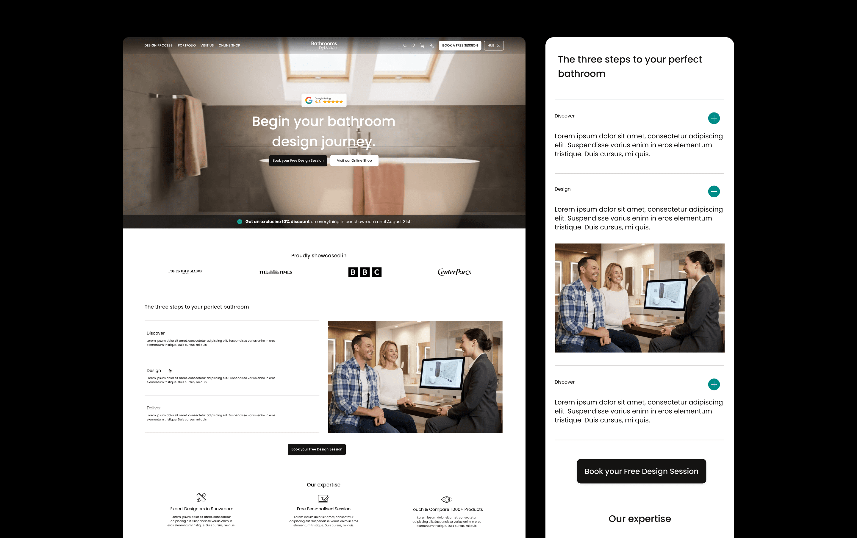
Bathroom by Design
We redesigned Bathroom by Design's e-commerce website and built a companion customer dashboard, bringing their catalogue, design service, showrooms, trade partnerships, and VR configurator into one connected platform. Even though the products themselves are complex, the result is a shopping and project-management experience that feels confident and easy to navigate.
UX/UI & DEVELOPMENT
B2C
Ecom
Bathroom by Design
We redesigned Bathroom by Design's e-commerce website and built a companion customer dashboard, bringing their catalogue, design service, showrooms, trade partnerships, and VR configurator into one connected platform. Even though the products themselves are complex, the result is a shopping and project-management experience that feels confident and easy to navigate.
UX/UI & DEVELOPMENT
B2C
Ecom

Axiom Stratum
We built the brand identity and website for Axiom Stratum, a consulting firm that needed to feel as credible as McKinsey or Blackstone from the first interaction. The result is a structured, authoritative system, logo, typography, and an editorial mono-column website, grounded by a warm, earthy palette inspired by African roots.
UX/UI & DEVELOPMENT
B2B
CONSULTING
Brand identity
Axiom Stratum
We built the brand identity and website for Axiom Stratum, a consulting firm that needed to feel as credible as McKinsey or Blackstone from the first interaction. The result is a structured, authoritative system, logo, typography, and an editorial mono-column website, grounded by a warm, earthy palette inspired by African roots.
UX/UI & DEVELOPMENT
B2B
CONSULTING
Brand identity

Stella
We built the brand identity for Stella, a human-first dating service for emotionally mature singles. The result is a thoughtful, modern system that sets Stella apart from swipe culture — warm, credible, and without the luxury-matchmaker feel.
Brand identity
B2C
LIFESTYLE
Stella
We built the brand identity for Stella, a human-first dating service for emotionally mature singles. The result is a thoughtful, modern system that sets Stella apart from swipe culture — warm, credible, and without the luxury-matchmaker feel.
Brand identity
B2C
LIFESTYLE

Joiia CBD
Joiia CBD sells its flowers, oils and resins through tobacconists, and runs two more brands for other shelves: Les Chanvrais in grocers, Fiore CBD in pharmacies. We designed the packaging for all three, each with its own system.
Brand identity
B2C
WELLNESS
PACKAGING
Joiia CBD
Joiia CBD sells its flowers, oils and resins through tobacconists, and runs two more brands for other shelves: Les Chanvrais in grocers, Fiore CBD in pharmacies. We designed the packaging for all three, each with its own system.
Brand identity
B2C
WELLNESS
PACKAGING

Saba Gourmet
We created the brand identity for Saba Gourmet, a gourmet food brand bringing North African influences into a contemporary Mediterranean world. The system connects its logo, packaging, print, social templates and delivery vehicles, giving the team a consistent identity to launch across physical and digital touchpoints.
Brand identity
B2C
FOOD & DRINK
Saba Gourmet
We created the brand identity for Saba Gourmet, a gourmet food brand bringing North African influences into a contemporary Mediterranean world. The system connects its logo, packaging, print, social templates and delivery vehicles, giving the team a consistent identity to launch across physical and digital touchpoints.
Brand identity
B2C
FOOD & DRINK

Boneca
We reimagined Boneca’s brand to resonate with the electronic music scene in London, creating an engaging and bold identity that speaks directly to their B2C audience. Our work included updating their visual language across event posters, social media, and other consumer touchpoints, ensuring the brand remains vibrant, edgy, and consistent across all platforms.
Brand identity
B2C
Boneca
We reimagined Boneca’s brand to resonate with the electronic music scene in London, creating an engaging and bold identity that speaks directly to their B2C audience. Our work included updating their visual language across event posters, social media, and other consumer touchpoints, ensuring the brand remains vibrant, edgy, and consistent across all platforms.
Brand identity
B2C